
Pareto Chart
Excel Template
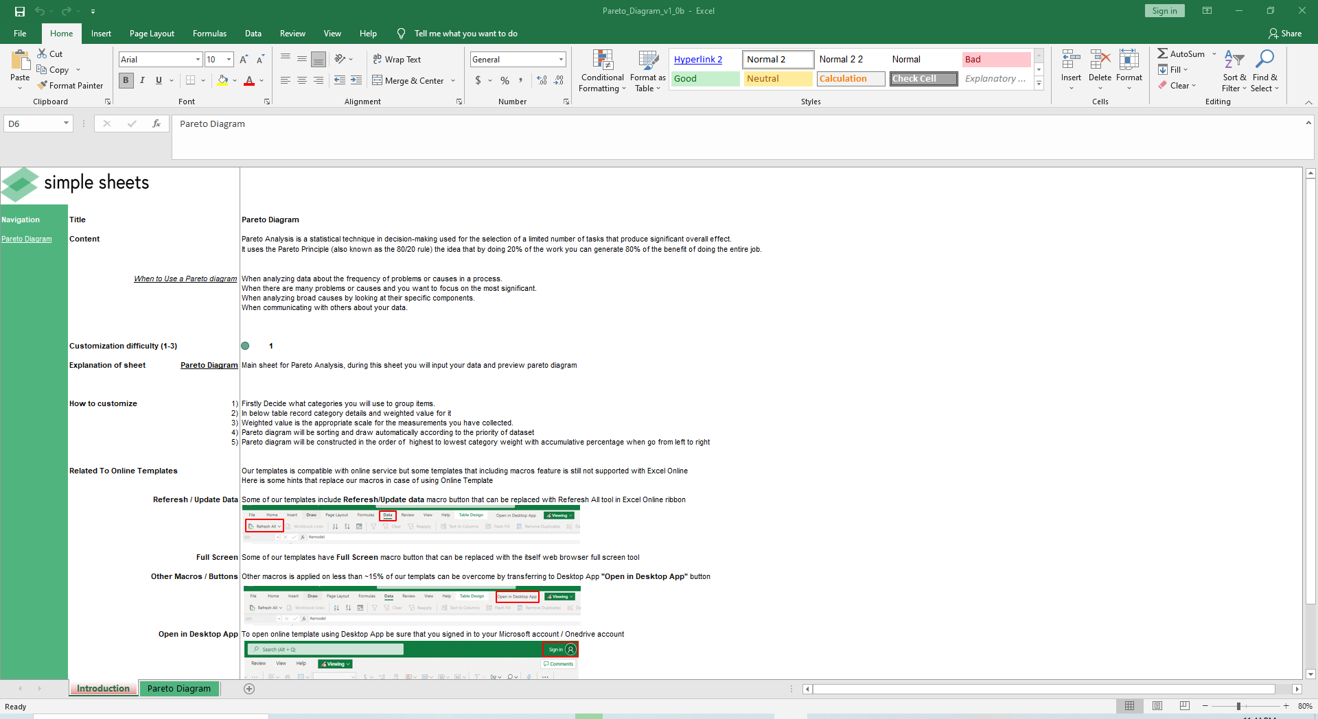
What's Inside the Pareto Chart Analysis Template?
Details | 2 Sheets
Supported Versions | Excel 2010, 2013, 2016, 2019, Office 365 (Mac)
Category | Supply Chain & Operations, Data Analysis
Tags | Frequency of Defects, Bar Chart, 80/20 Rule, Diagram
Why Professionals Choose Simple Sheets
It's simple. Access to the largest library of premium Excel Templates, plus world-class training.

100+ Professional Excel Templates
Optimized for use with Excel. Solve Excel problems in minutes, not hours.

World-Class Excel University
With our university, you'll learn how we make templates & how to make your own.

How-To Videos
Each template comes with a guide to use it along with how-to videos that show how it works.
Inside Our Pareto Chart
Excel Template
Once you know the 80/20 rule, you can’t unsee it. It exists in nearly every industry, business and walk of life. Also known as the Pareto Principle, the rule observes that in many cases 80% of the output comes from 20% of the input. While the percentages are not perfectly applied to every situation, the rule implies a power imbalance.
A real life example of this: top salespeople are known to ‘crush’ (their words not mine). It’s not rare for the top 20% of salespeople to generate 80% of total sales or profits for a company. On the flip side, the bottom 80% of salespeople only generate 20% of the sales or profits for a company.
Because the 80/20 rule applies to so many situations, it’s a popular analysis applied to a set of data that may have this sort of relationship. That’s where our Pareto Analysis Excel Template comes in handy.
If you find this template useful, you’ll also love our other Excel templates for data analysis like Scatter Diagram Analysis, Box and Whisker Plot and Sales Trend Analysis. These templates are designed to help you understand general data sets and find relationships.
Let’s dive into how to use our Pareto Analysis Excel Template.
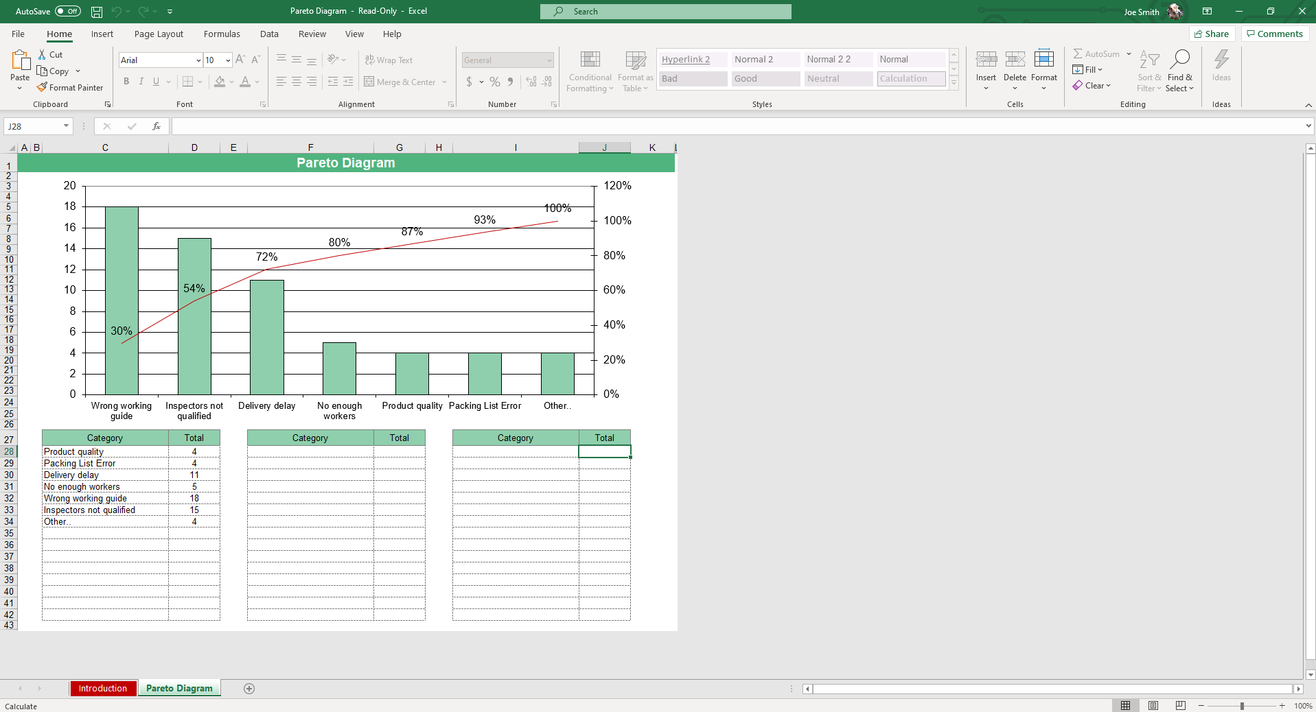
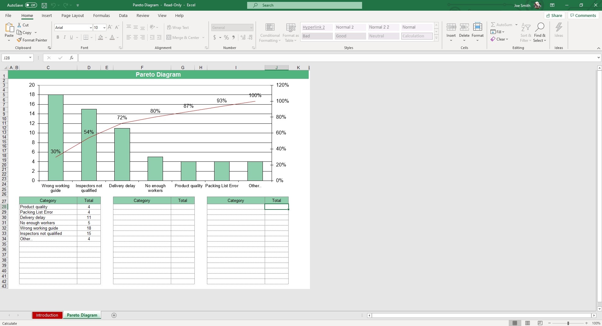
Start off by deciding what categories you will use to group items. In the below table, record category details and weighted values.
The diagram will sort and draw automatically according to the priority of the dataset.

It will be constructed in the order of highest to lowest category weight with the cumulative percentage starting from left to right.
The diagram/chart will update automatically so you can easily discern where Pareto’s Principle exists.
We love the usability of this template and how practical it is. Understanding where this 80/20 concept exists can lead to clear actions that remove bottlenecks in your manufacturing, engineering and process improvement departments.
More Operations Templates For You


