
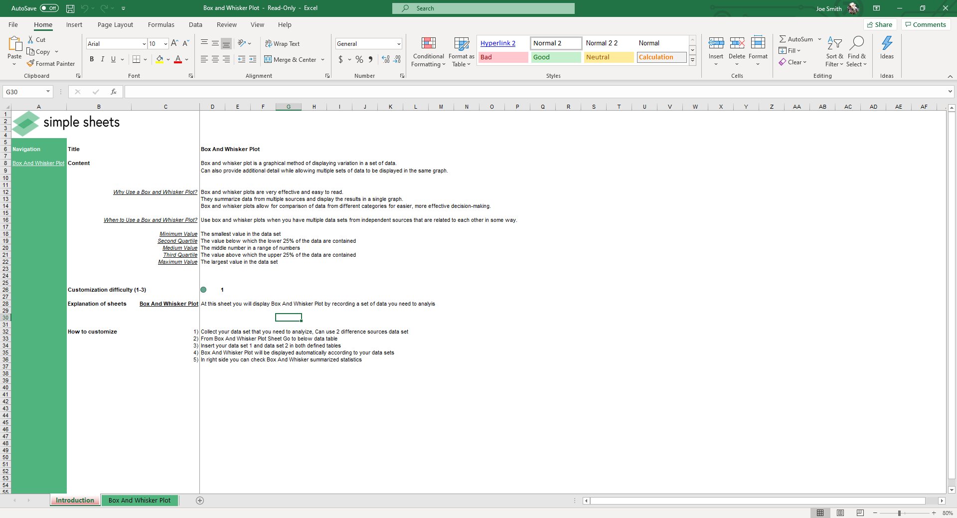
Box and Whisker
Plot Maker
Excel Template
What's Inside the Box and Whisker Plot Template?
Details | 2 Sheets
Supported Versions | Excel 2010, 2013, 2016, 2019, Office 365 (Mac)
Category | Operations, Data Analysis
Tags | 5 Number Summary, Mean, Median, Average, Quartile
Why Professionals Choose Simple Sheets
It's simple. Access to the largest library of premium Excel Templates, plus world-class training.

100+ Professional Excel Templates
Optimized for use with Excel. Solve Excel problems in minutes, not hours.

World-Class Excel University
With our university, you'll learn how we make templates & how to make your own.

How-To Videos
Each template comes with a guide to use it along with how-to videos that show how it works.
The Best Box and Whisker Plot Excel Template

Need to visualize your data with clarity and speed? Our free box and whisker plot template helps you create professional-quality box charts in Excel. You don’t need any coding or chart-building experience. Just input your data, and the chart will update automatically. Our box plot template is perfect for comparing datasets, spotting outliers, and saving time on data analysis.
Why Use a Box Plot Template in Excel?
Box plots turn raw numbers into quick insights. They help you see the shape of your data without digging through spreadsheets. Here’s why our box and whisker plot excel version is a smart choice:
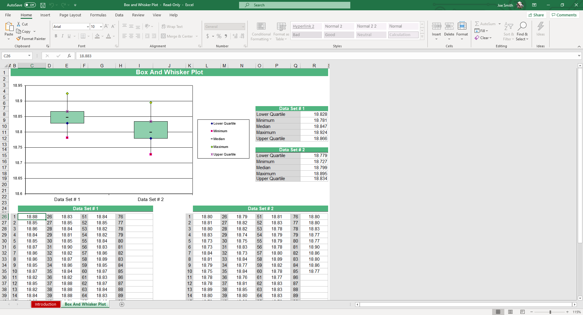
- Visualize data distribution: Instantly see the lower quartile, minimum, median, maximum, and upper quartile.
- Compare groups side-by-side: Compare categories or datasets in a single view. Great for spotting differences across teams, time periods, or experiments.
Features Included
This template handles the technical heavy lifting so you can focus on the analysis:
- Handles negative values and IQR whiskers: Accurately displays values below zero and adjusts whiskers based on the interquartile range.
- Auto-calculates quartiles, median, and IQR: Background formulas run quietly—no manual setup required.
- Toggle Outliers & Mean Markers: Customize your view with a simple setting to show or hide detailed data indicators.
| Feature | Specification |
|---|---|
| File Format | .xlsx (Excel), Google Sheets |
| Compatibility | Excel 2010+ (PC/Mac), Office 365 |
| Visuals | Auto-Updating Box & Whisker Charts |

The Best Box and Whisker Plot Excel Template & Worksheet
Need to visualize your data with clarity and speed? Our professional box and whisker plot excel template helps you create high-quality charts in seconds. Whether you are using it as a box and whisker plot worksheet for academic analysis or a business reporting tool, you don’t need any coding or chart-building experience. Just input your data, and the chart updates automatically.
Expert Walkthrough: How it Works
Unlike standard Excel charts that can be difficult to format, our template uses a robust calculation engine to ensure data integrity:
- Automated Quartiles: Uses standard Excel logic to calculate Q1, Median, and Q3 instantly.
- Outlier Management: Identifies data points outside 1.5x the IQR (Interquartile Range) automatically.
- Lean Six Sigma Ready: Perfect for Quality Control and Supply Chain professionals who need side-by-side comparison for process variation.
Quick Setup
This template is built to save you time. Instead of writing formulas or format charts, you can get it all done for you in just a few steps.
Step 1: Enter your data.
Start by plugging your numbers into the two tables labeled Data Set #1 and Data Set #2. You can use one or both, depending on how many groups you want to analyze. Each column supports a full list of values. The table sits right below the chart, so it’s easy to see what you’re working with.
Step 2: Let the template do the work.
As you type, the sheet runs calculations automatically in the background. It pulls your minimum, lower quartile (Q1), median, upper quartile (Q3), and maximum without any manual setup. You’ll also see a clean summary box with the five-number breakdown for each dataset.
Step 3: Instantly view the chart.
Your box and whisker plot appears just above the data tables, updating in real time. Each data point is color-coded and aligned with the summary. It even detects and displays outliers without extra steps.
What is a Box and Whisker Plot?
A box and whisker plot is a standardized way of displaying the distribution of data based on a five-number summary: minimum, first quartile (Q1), median, third quartile (Q3), and maximum. It is the most efficient visual to show the spread and skewness of your numerical data and to identify outliers at a glance.
Frequently Asked Questions
Is this a one-time purchase or a subscription?
This is a one-time purchase. Once you download the template, it is yours to keep forever with no recurring fees.
Can I use it in Excel 2013?
Yes. The template is compatible with Excel 2010, 2013, 2016, 2019, and Office 365 for Mac.
How do I show negative values?
Simply enter your data into the table; the chart automatically adjusts the Y-axis to account for negative distribution.
Is the template customizable?
Absolutely. You can change colors, labels, and axis ranges directly within Excel's standard formatting tools.
More Templates Like This
More Data Analysis Templates For You


