
COVID-19 Dashboard
Excel Template
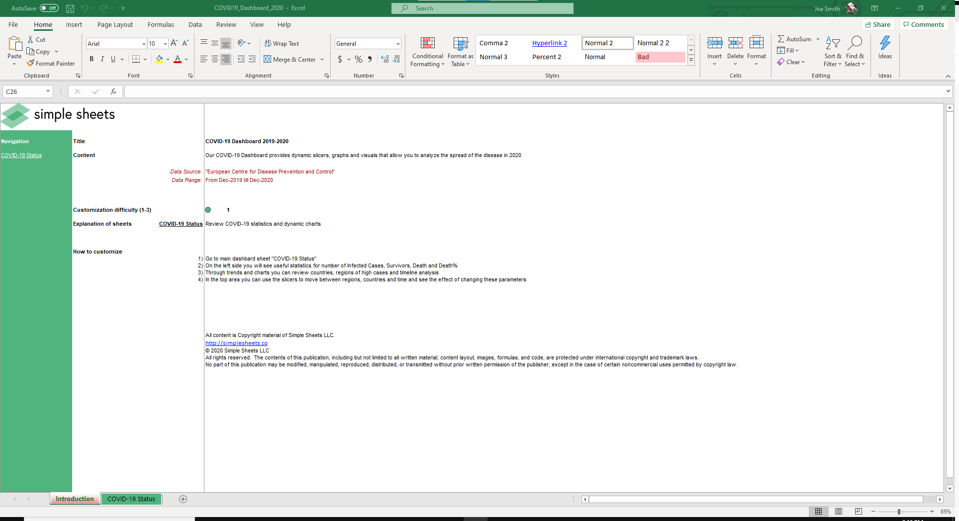
What's Inside the COVID-19 Dashboard?
Details | 2 Sheets
Supported Versions | Excel 2013, 2016, 2019, Office 365 (Mac), Power BI*
Category | Data Analysis
Tags | Covid Analysis, Covid 2020
Why Professionals Choose Simple Sheets
It's simple. Access to the largest library of premium Excel Templates, plus world-class training.

100+ Professional Excel Templates
Optimized for use with Excel. Solve Excel problems in minutes, not hours.

World-Class Excel University
With our university, you'll learn how we make templates & how to make your own.

How-To Videos
Each template comes with a guide to use it along with how-to videos that show how it works.
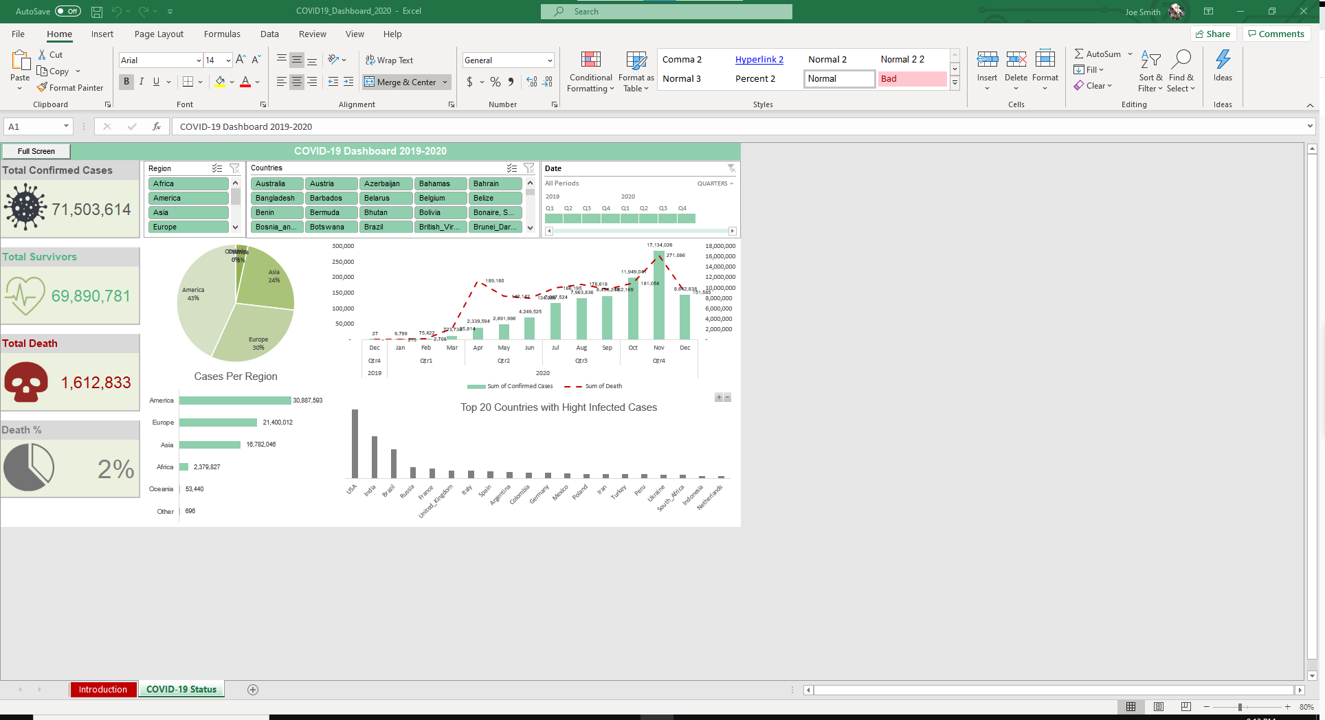
Inside Our Covid-19 Excel Dashboard
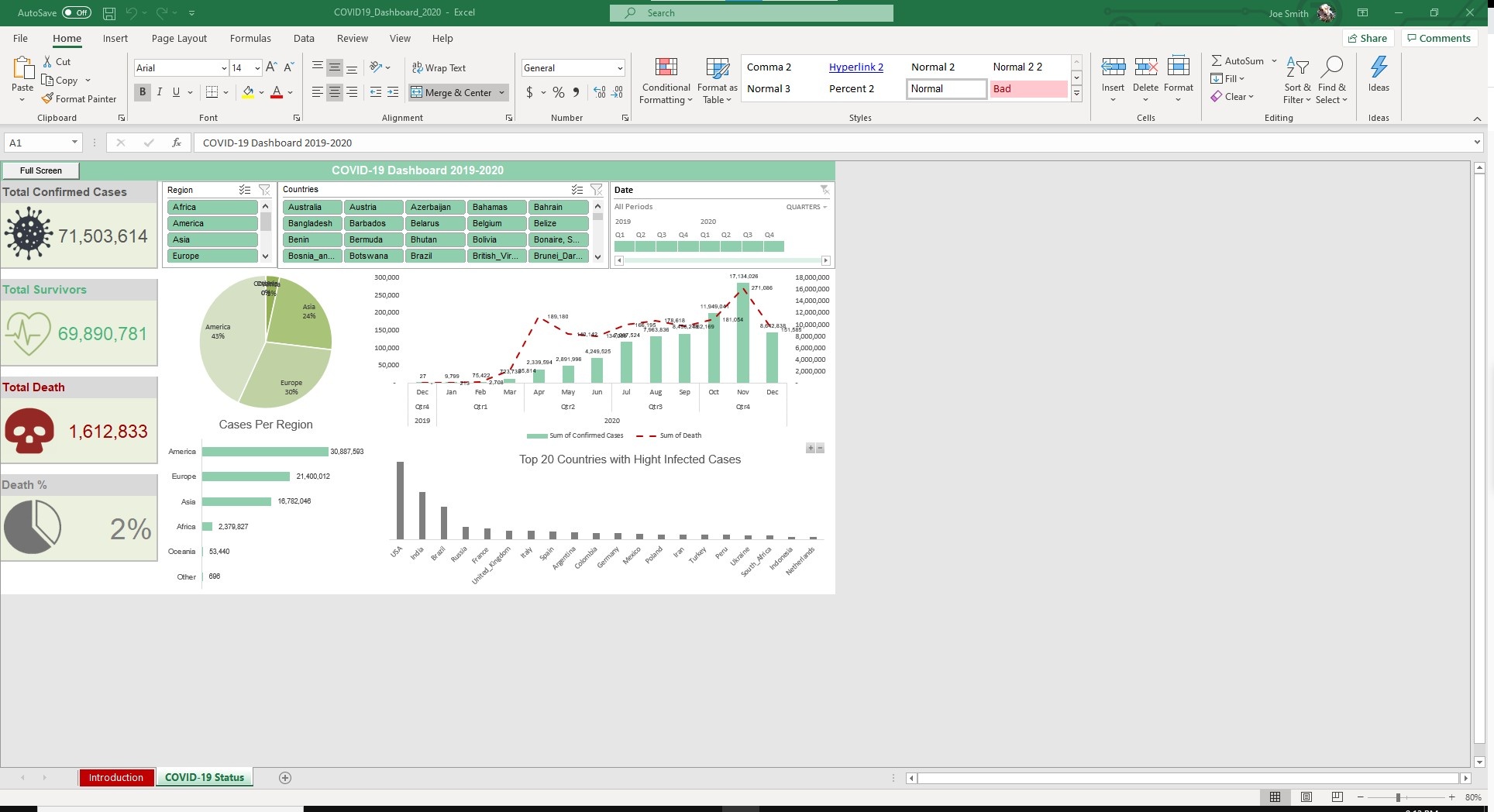
COVID-19 has swept through the globe, causing millions of deaths and altering society at its core.
It's affect is not limited to a single country or region, but the entire world. Some parts though, have been more affected than others.
With so much confusion around the impact of the coronavirus, we designed a COVID-19 Excel Dashboard.
Dynamic slicers allow you to see the impacts of COVID as you can filter by region, countries and date. Total Confirmed Cases, Total Survivors, Total Deaths and Death % will auto populate based on your criteria.
A chart plotting cases over a 12-month period will also generate automatically.
If you are using it for a presentation, you can click Full Screen to make the visuals pop.
This is a free dashboard, as is the COVID-19 Employee Health Tracker Template.


While we build most of our Excel templates with dynamic dashboards, Power BI is a Microsoft tool that allows for even greater visualization and customization.
We've paired our Profitability Analysis spreadsheet with a Power BI compatible dashboard that gives you further capabilities for filtering and analyzing your data.
Using Power BI, the map is totally interactive and you can immediately see COVID statistics for each country. Comparing and analyzing the impacts by country is easy with this tool.
*Power BI templates are only available for Mastermind Members.
More Data Analysis Templates For You


