
Stratification
Data Analysis
Excel Template
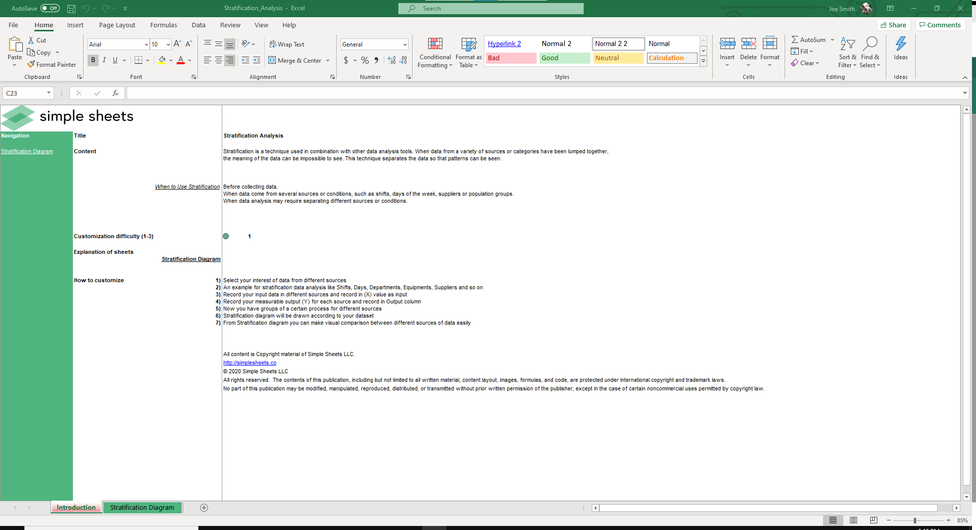
What's Inside the Stratification Data Analysis Template?
Details | 2 Sheets
Supported Versions | Excel 2010, 2013, 2016, 2019, Office 365 (Mac)
Category | Operations, Data Analysis
Tags | Social, Global, Variable, Sampling
Why Professionals Choose Simple Sheets
It's simple. Access to the largest library of premium Excel Templates, plus world-class training.

100+ Professional Excel Templates
Optimized for use with Excel. Solve Excel problems in minutes, not hours.

World-Class Excel University
With our university, you'll learn how we make templates & how to make your own.

How-To Videos
Each template comes with a guide to use it along with how-to videos that show how it works.
Inside Our Stratification Data Analysis
Excel Template

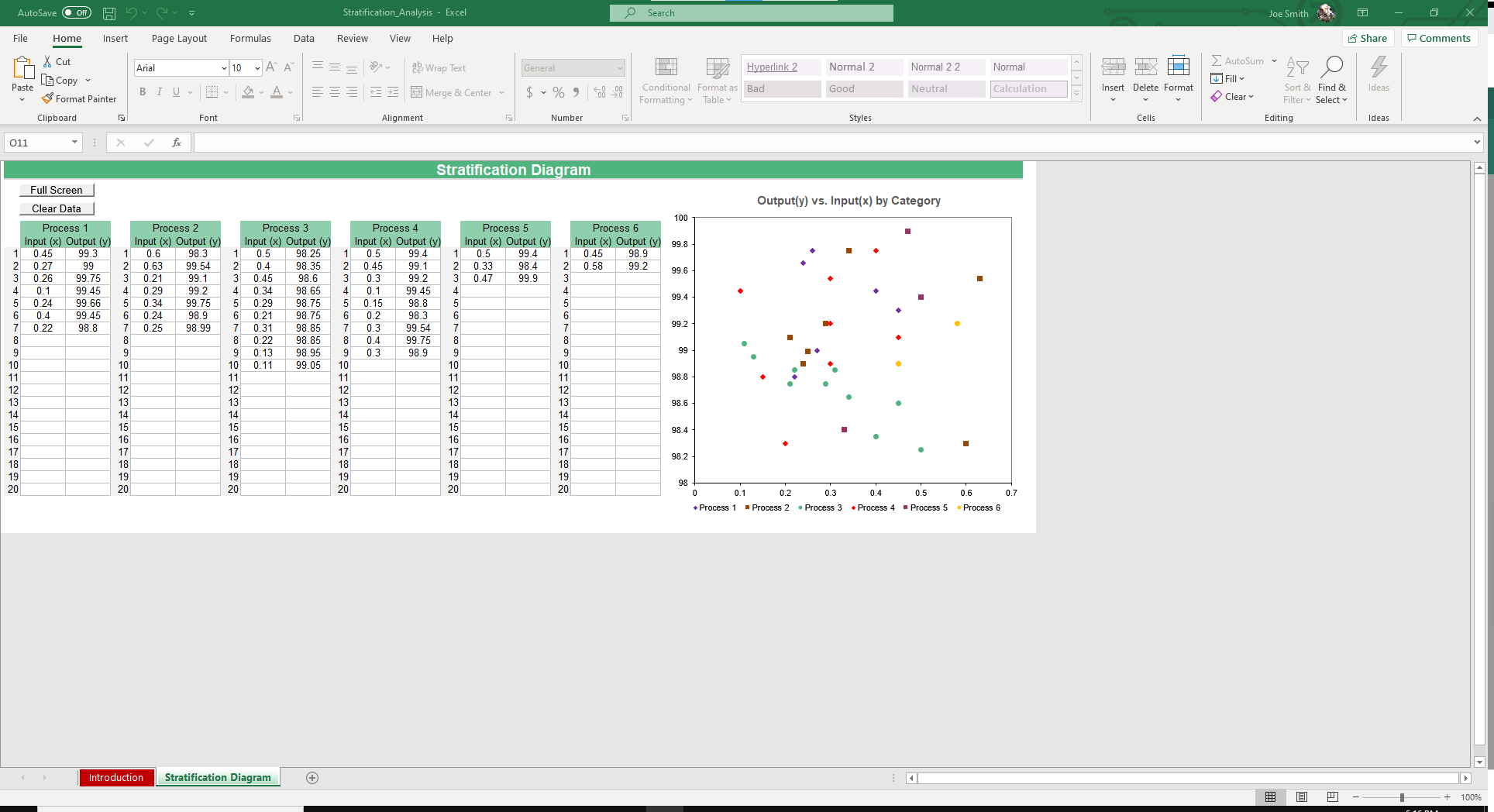
Stratification takes data from a variety of sources or categories that have been lumped together and separates the data to make it possible to identify trends. People use stratification for analyzing data that comes from different sources such as shifts, days of the week, suppliers or population groups. It helps identify possible relationships between any of the sources.
If you like our Stratification Data Analysis Excel Template, you’ll also enjoy our Pareto Diagram and Year Wise Analysis templates that help you identify trends, outliers and power laws in data sets.
Let’s dive into the instructions for how to run a stratification analysis.
There are 6 processes in this spreadsheet. For each process, record your Input (x) and Output (y) in up to 20 rows.
Boom. You just ran a stratification analysis.
Your data will auto populate immediately in the Output vs. Input by Category chart.
Evaluate the chart and see if you can notice any obvious relationships between the categories. If you can find one, you may want to run more kind of statistical tests, but you may also have the answer you’re looking for.
Analysis like this leads to better data which should equal better results. Here is a general scenario in which this could be helpful.
Imagine you run a warehouse, like Daryl from the Office. On days where it rains or is cold, absences increase substantially and productivity goes down. Rather than sit on this data and miss out on potential gains, you could turn up the heat in the warehouse, offer lunch for your team, or give free company beanies so people are less cold. Any number of these solutions could end up increasing productivity and morale among employees.
Or, the data could even be telling you that the boss from upstairs, perhaps a Michael Scott like figure, causes so much distraction in the warehouse he’s permanently banned.
See, data analysis examples can be fun.
More Data Analysis Templates For You


