
Panel Analysis
Excel Template
What's Inside the Panel Analysis Template?
Details | 2 Sheets
Supported Versions | Excel 2010, 2013, 2016, 2019, Office 365 (Mac)
Category | Data Analysis
Tags | Regressions, Charts
Why Professionals Choose Simple Sheets
It's simple. Access to the largest library of premium Excel Templates, plus world-class training.

100+ Professional Excel Templates
Optimized for use with Excel. Solve Excel problems in minutes, not hours.

World-Class Excel University
With our university, you'll learn how we make templates & how to make your own.

How-To Videos
Each template comes with a guide to use it along with how-to videos that show how it works.
Inside Our Panel Analysis
Excel Template

Our Panel Analysis Excel Template makes it easy to, you guessed it, run panel analysis.
If you love data analysis, you’ll also want to check out our Check Sheet, Stratification and Box and Whisker Plot templates. Excel is one of the best programs for crunching numbers so we’ve made sure to provide a number of solutions to help you understand your data better and in a faster amount of time than constructing formulas and charts yourself.
Panel Analysis is used to compare longitudinal data over a period of time. It’s popular when looking at data in economics, finance and social sciences and suitable for multilevel or hierarchical modeling. Often, people use either Fixed Effects or Random Effects when using Panel Analysis. You can read more about how to use Panel Analysis from Princeton.
Let’s dive into how to use this template.
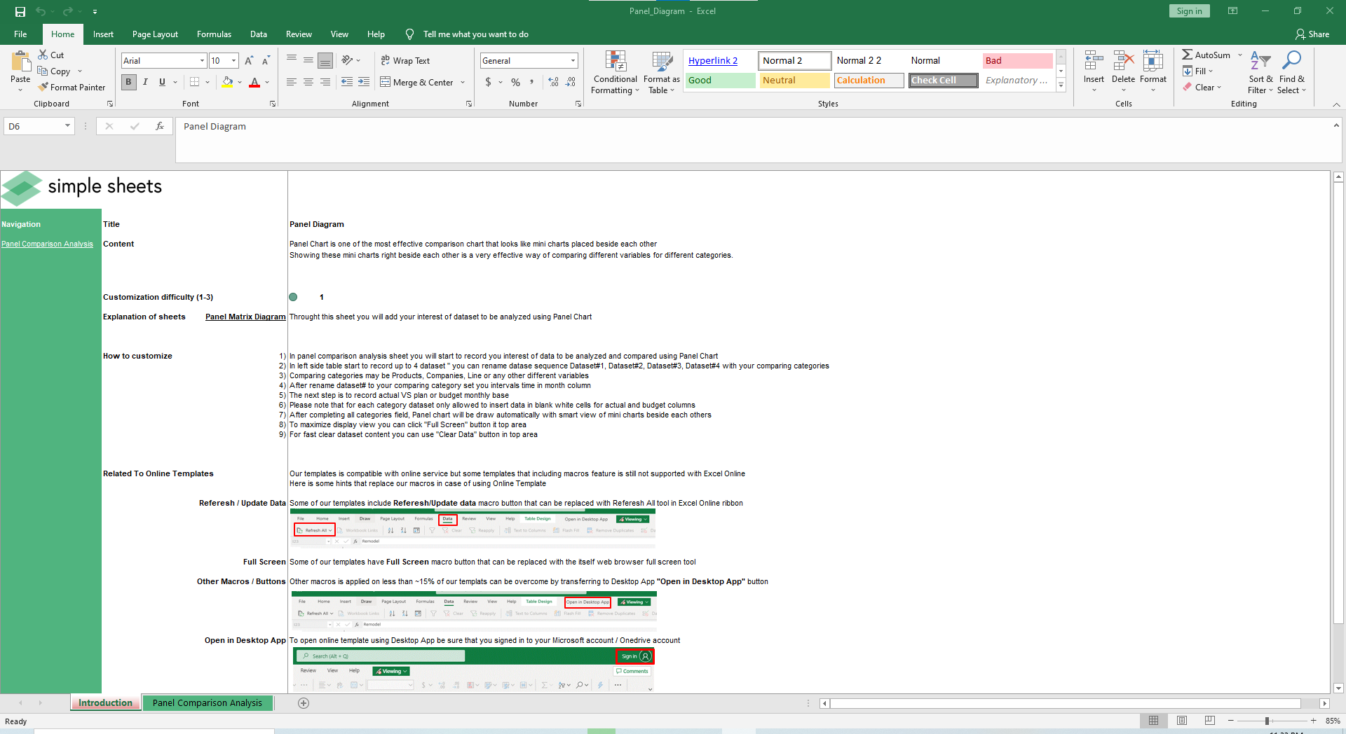
There’s only one active sheet, so go to the Panel Comparison Analysis tab.
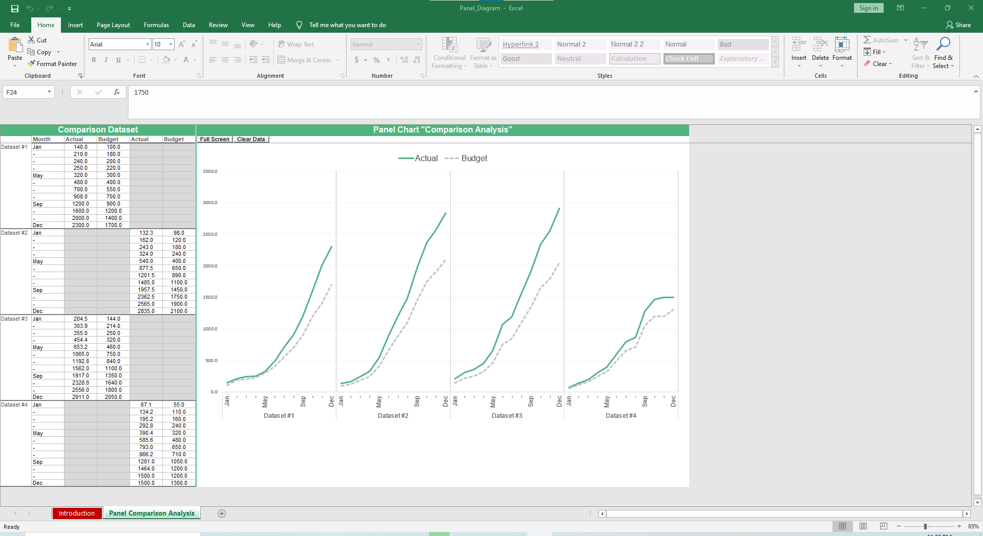
In the left side table, record up to 4 datasets. You can rename the Datasets to whatever you are comparing. Currently, there are placeholders for the names like Dataset #1, Dataset #1 and so forth. Your categories may be products, companies, line etc,.
Set your intervals time in the Month column. Record Actual vs. Budget.
After completing all fields, the Panel Chart will auto populate with a smart view of mini charts beside each other.

Want to clear your dataset and input another one? Easy. Just click the Clear Data button. Right next to that is the Full Screen button if you are giving a presentation or want a clear look at the data without any distractions on your screen.
As with most of our templates, some cells are locked to protect the formulas. Same goes for this template as you’ll only be able to fill in the blank white cells for actual and budget columns.
More Data Analysis Templates For You


