
How to Insert Line of Best Fit in Google Spreadsheets
Jun 03, 2022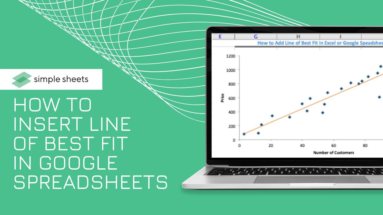
Visualizing data through graphs and charts is a fantastic way to understand data and the relationships between different data points.
This article will show you how to add a line of best fit in google sheets to understand the trends within your data further.
Get our free Excel formulas cheat sheet
Plus new tutorials and template drops. Enter your email and we'll send it over.
What is a Line of Best Fit?
A line of best fit, also referred to as a trend line, is a line that sits within your chart to help understand trends within your data.
These lines allow you to understand the direction of your data, estimate forecasts, and many other beneficial uses.
How to Add a Line of Best Fit in Google Sheets
Before we add a line of best fit in Google Sheets, let's quickly go over how to create a scatter chart within Google Sheets to highlight your data.
Creating a Scatter Chart in Google Sheets
To create your scatter plot, follow this step-by-step guide:
-
Choose the data range, as well as any column headers.
-
Select the Insert menu via the menu bar
-
Choose the Charts option.
-
From here, you will notice a chart displayed on your worksheet, and a Chart Editor sidebar will appear on the right side of your window.
-
Google Sheets starts by attempting to recommend a chart based on your data. If the chart chosen is not a scatter chart, head to the next step.
-
To change your display chart to a scatter chart, choose the Setup tab within the Chart Editor, and select the drop-down menu below Chart Type.
-
From here, choose Scatter Chart.
How to Find the Line of Best Fit on Google Sheets
To find the line of best fit in google sheets, you do not need to use an equation. Instead, making simple customizations to your scatter plot would be best.
Within the Chart Editor sidebar are two tabs: Customize and Setup. The Customize tab offers different choices to customize different aspects of your chart.
To include the best-fit line to your Scatter plot, you must access the Customize tab and follow these steps:
-
Select the Customize tab from the Chart Editor
-
Choose the Series drop-down menu.
-
Scroll to the bottom of the drop-down menu until you notice three checkboxes
-
Click on the Trend Line checkbox.
Following these steps will show your trendline across the scatter chart. This is the easiest way to add trendlines to a new chart and show off any data. The line should be straight, and make sure the trendline fits your graph as expected.

Making Changes to the Trend Line
Now you understand how to find the trend line and might want to customize it to suit your chart.
From below the trend line checkbox, there are several customization options.
You can choose exponential, linear, logarithmic, power series, moving average, or polynomial trendlines.
You can also amend the line color, change the thickness or opacity of your trend line, or amend the label.
Frequently Asked Questions About Inserting a Line of Best Fit in Google Sheets:
Can you add a line of best fit in Google Sheets?
If your Google Sheets document contains a scatter plot, it is easy to add a line of best fit to your plot.
Once the data is updated, the line of best fit will update automatically to show any changes.
How do you make a line of the best-fit graphs on Google Docs?
Once you have created your scatter plot, you can include a line of best fit by opening your Chart Editor and selecting the three dots from the right-hand corner. From here, ensure customize is selected. Below "Series" is a check box to add the line of best fit.
Related Articles:
How to Sort by Date in Google Sheets: Quick and Easy Steps
How to Make a Calendar in Google Sheets
Google Sheets Highlight Duplicates: Everything You Need to Know
Want to Make Excel Work for You? Try out 5 Amazing Excel Templates & 5 Unique Lessons
We hate SPAM. We will never sell your information, for any reason.

