
What is a Sunburst Chart and When to Use a Sunburst Chart in Excel
Jul 26, 2022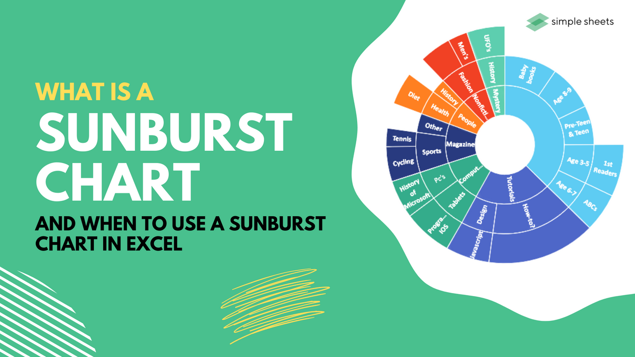
A sunburst chart, also known as a radial treemap or a ring chart, is often implemented as a visual aid for hierarchical data.
A sunburst chart is fantastic for data visualization as it highlights hierarchy through concentric rings. Every ring is a level of the hierarchy. Each right is proportional to highlight its details.
Focusing on one segment of the ring offers a sense of the part to the entire relationship of that segment regarding the parent node.
This article will explain sunburst charts in more detail, why this is one of the best chart tools in Excel, and how to use it to identify deeper hierarchy levels. 
Components of a Sunburst Chart
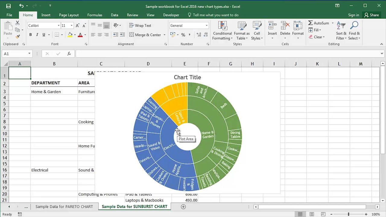
A sunburst chart consists of many different aspects. For starters, the rings of sunburst charts are split up based on hierarchical data structures related to the parent node.
Every ring can contain multiple segments, with each segment highlighting the contribution of a particular dimension within that hierarchy chart.
Focusing on one segment within the ring chart offers a sense of the part to the entire relationship of that dimension compared to the parent ring segment. The slices within the hierarchical chart could use various colors for each category and may not be divided equally.
Treemap vs. Sunburst chart.
With a treemap, the space you have to plot drops significantly as you head down each hierarchical level. This lack of space results in a limit to how many levels you can show at once.
As each category delves into deeper hierarchy levels, they become more challenging to read. A treemap data table is excellent for macro-level data analysis but not very effective if you need to dig deeper into the subcategories.
With a simple sunburst chart, data visualization could not be easier! The chart design allows us to head down each hierarchical level with more space on every level. A sunburst chart is best if you include multiple layers or hierarchical levels.
Multi-level Pie chart vs. Sunburst chart.
A multi-level pie chart is a chart type that lets you show asymmetrical and symmetrical tress structures within a pie-like chart. It offers a view of the entire hierarchical relationship in one view, which is ideal compared to a tree view.
Sunburst charts show category hierarchy, which offers a clear understanding of lineage.
Advantages and Disadvantages of the Sunburst Chart
Advantages.
The radial orientation of your sunburst chart uses space much better than linear chart tools. As a sunburst chart resembles a pie or doughnut chart design, it is easy to understand and visualize the data.
Disadvantages.
The radial structure of a sunburst chart limits how many nested levels can be easily analyzed from a static image. It is hard to understand angular readings.
Frequently Asked Questions:
What is a sunburst chart?
A sunburst chart, also known as a radial treemap or a ring chart, is often implemented as a visual aid for hierarchical data.
When would you use a sunburst chart?
A sunburst chart is fantastic for data visualization as it highlights hierarchy through concentric rings. 
Related Articles:
How to Insert Line of Best Fit in Google Spreadsheets
Microsoft Excel is Waiting for Another Application to Complete an OLE Action - What Does This Mean?
Want to Make Excel Work for You? Try out 5 Amazing Excel Templates & 5 Unique Lessons
We hate SPAM. We will never sell your information, for any reason.

