
How to Add a Trendline in Excel Online
Aug 17, 2022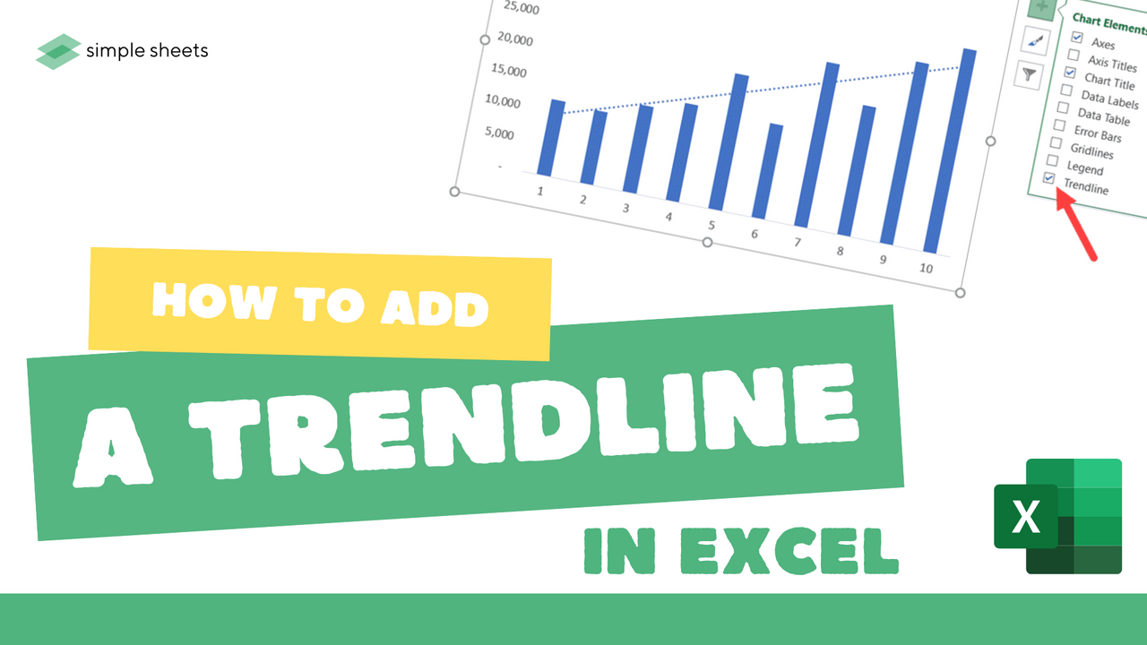
Adding multiple trendlines to an Excel online document is a great way to display your data clearly and precisely.
Luckily for you, using Excel Charts makes building trendlines in your data quick and straightforward. A linear trendline identifies any trends in your data and shows the trajectory of your data.
Get our free Excel formulas cheat sheet
Plus new tutorials and template drops. Enter your email and we'll send it over.
This article will show you how to add a trendline to different chart elements on Excel Online.
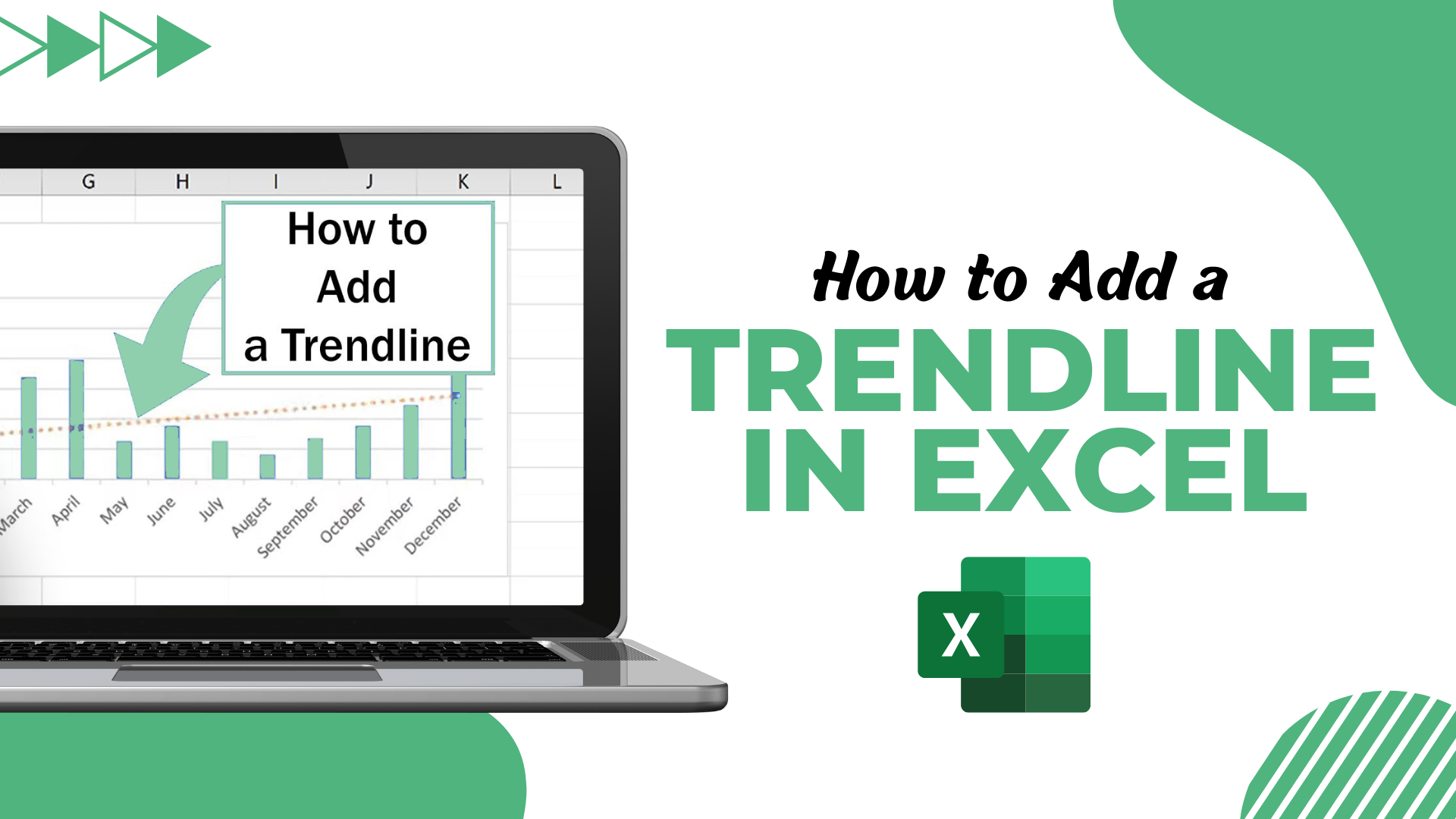
How to add Trendline in Excel
Let's jump in and learn how to insert a trendline in Excel using a Line Chart.
-
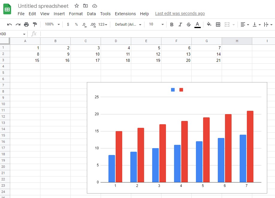
Firstly, select the table of data you want to be included.
-
Click on Insert and Recommended Charts,
-
Choose Insert, Line, or 2D Line.
-
Choose All Charts, Line, and then select OK.
-
Once created, right-click on your line within the Line Chart and choose to Add Trendline.
-
Check Linear Trendline is chosen and close the Format Trendline Window.
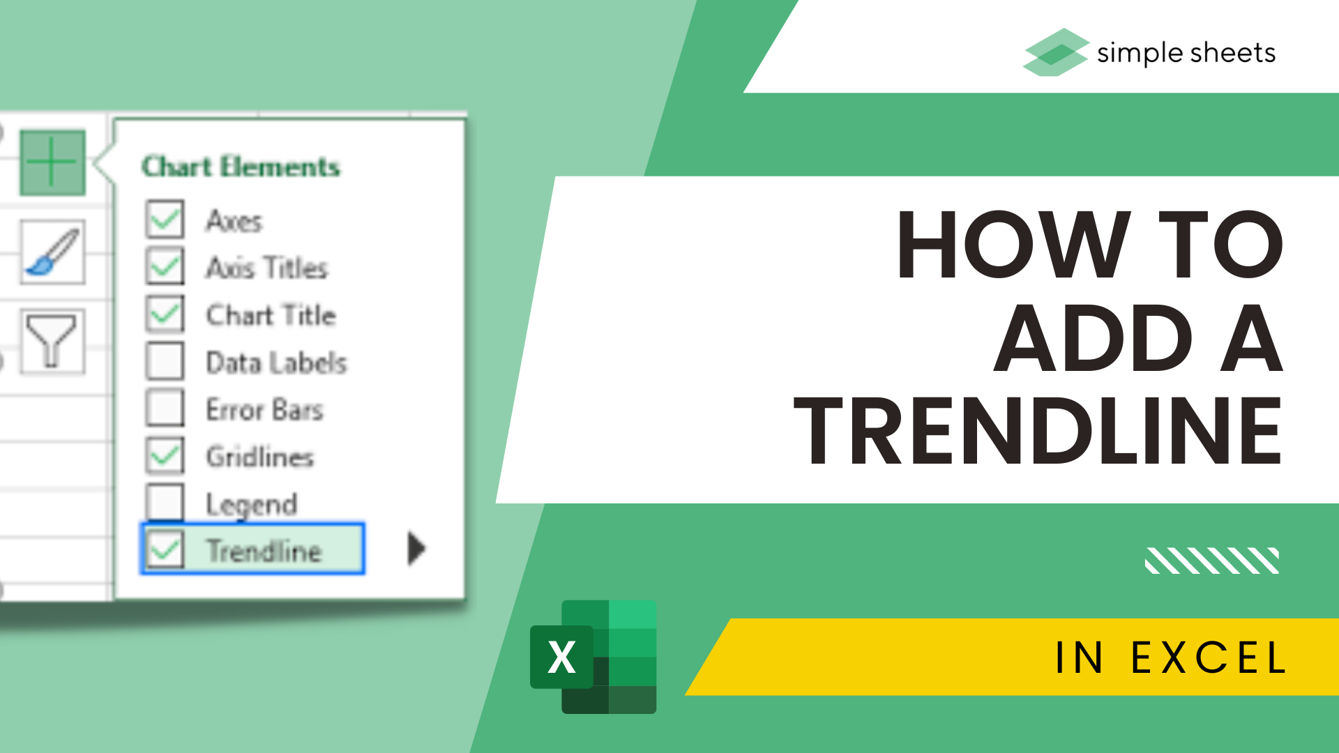
Different types of Trendlines
There are various trend lines you can choose to add to your Excel chart.
Exponential - this chart type shows the decrease/increase in the value of your data at an increasingly higher rate. It tends to be more curved on one side.
Linear - This trend line is a straight line that highlights the decrease/increase in the value of your data over time.
Polynomial - This trend line is curved and used when data fluctuates more than a simple rise and fall.
Moving Average - This smokes out extreme fluctuations within your data and highlights data trends.
Logarithmic - This Trendline gets used for data that quickly decreases/increases and then levels out.
Format the Trendline
Now you understand how to add a trendline in Excel online, and it's essential to know how to format them. You can change the transparency, width, Color, compound type, etc. Here's how to change the Color of your trend line.
-
Right-click on your Trendline.
-
Choose the Format Trendline option.
-
From the Format Trendline pane, select the Fill & Line category.
-
Choose your Color and hit Enter.
Use Trendline to Forecast Future Data
You have the power to extend your data and forecast the data trend in Excel using the trend line feature.
For example, follow these steps to forecast future data, such as sales for six periods.
-
Double-click on the Trendline, which will open the Format Trendline pane.
-
Choose the Trendline Options tab.
-
From Forecast, type in 6.
-
Hit enter, and you will notice your project data trend appear.
Suggested read: Excel Guide for Beginners
Add Multiple Trendlines to The Same Chart
We have focused on adding a single trendline in Excel online. Now let's look at adding multiple trendlines to a single chart.
Perhaps you want to add a moving average trendline and a linear trendline to your Excel online document. Add your linear trend line first, using the steps outlined above, and then use these steps to add your moving average trend line.
-
Select the Chart Elements icon. The add chart element button is the "+" icon in the top right-hand corner of your chart.
-
Select the arrow next to Trendline.
-
Choose the Two Period Moving Average option.
-
Choose the series
Once confirmed, Excel Online will display both trend lines in a single chart.
How to remove Trendline in Excel
Perhaps you have added your Trendline, and upon reflection, you no longer want to include it in your Excel chart. Don't worry; getting rid of a trendline in Excel online is quick and easy.
-
Select the Excel Chart
-
Choose the Chart Elements icon.
-
Uncheck the Trendline button.
How to Add a Trendline in Excel Online: Summary and Key Takeaways.
Now you have a clear grasp on how to add a single trendline, multiple trendlines, or remove trendlines from your Excel online document.
Adding multiple trendlines can be an excellent way to show off data and progression, so be sure to use this skill the next time you want to track growth, sales, or progress in any way!
And be sure to check out the Simple Sheets blog for other inciteful Google Sheets and Microsoft Excel tips.
Suggested read: Everything You Need to Know About Sunburst Chart in Excel
Frequently Asked Questions:
What is a trend line?
Trendlines show the best fit of your data using a curve or single line. One Trendline can be used to show a clear trend within a chart.
Is a trend line good for plotting a data point?
Absolutely. In a scatter plot, your trend line is fantastic for highlighting any correlations in your data.
Can you add trend lines to a bar chart from the chart design tab?
Following the steps outlined above, you can add trendlines to your chart and better understand your data.
Related Articles:
Excel: Remove Trailing Spaces Quickly and Easily With These Simple Steps
Want to Make Excel Work for You? Try out 5 Amazing Excel Templates & 5 Unique Lessons
We hate SPAM. We will never sell your information, for any reason.

