
Quick Guide: How To Insert Line Charts In Excel
Mar 21, 2023
Are you looking for a way to present complex data in an easy-to-digest way?
Well, with Excel, you can create graphs and charts. For example, you can use bar graphs to demonstrate proportions. Meanwhile, if you want to observe data changes over time, line graphs are the perfect solution.
However, be cautious. Your graph may become inaccurate if you don't chart the data correctly.
Read on as we show you how to insert a line in Excel while discussing the following :
-
What Is a Line Chart?
-
Make a Line Chart in Excel.
-
Format a Line Chart in Excel.
-
How to Make a Line Chart with Multiple Lines.
-
Final Thoughts on How to Insert Line Charts in Excel.
-
Frequently Asked Questions on How to Insert Line Charts in Excel.

What Is a Line Chart?
A line graph or run chart in Excel is a simple yet powerful visual aid generally used to display continuous data points. Line graphs can include one line for one data set or multiple lines for comparing different data sets.
The essential parts of a line chart include the following:
- X-axis or Horizontal Axis - The X-axis's purpose is to present periods. It is the independent part of the graph.
- Y-axis or Vertical Axis - This is the line on a graph representing the dependent variable and the data point.
- Legend - This section explains what the data labels represent. It tells what each line means. Legends are helpful when there is more than one line in a graph.
- Plot Area - This is the area where the data is displayed.
Note: Line graphs are not ideal for all kinds of data. For example, use an Excel bar graph when comparing different groups like age, classes, and schools.
Read Also: How To Organize A Spreadsheet By Date [Quick Guide]
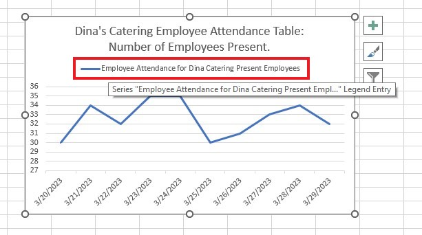
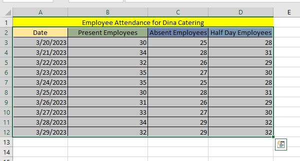
Make a Line Chart in Excel
Here are the steps on how to use Excel 2019 for Windows to make a basic-line graph:
-
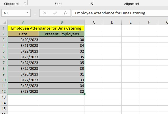
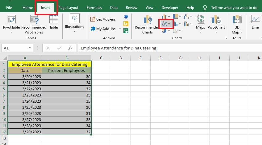
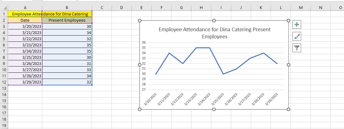
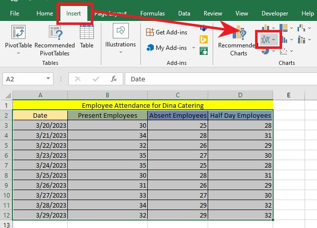
Select all the data in the table.
-
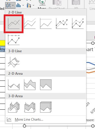
Navigate to the Insert tab and choose Insert Line or Area Chart from the Charts group.
-
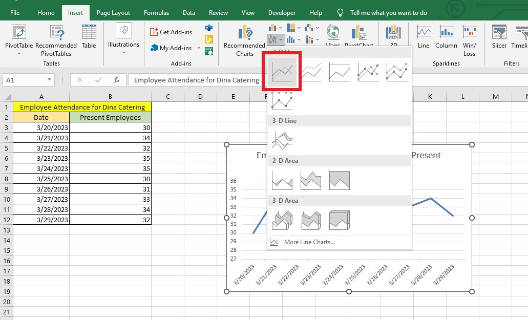
In the 2-D Line Section, click your preferred line chart style.
You have now successfully inserted your line chart into your spreadsheet.
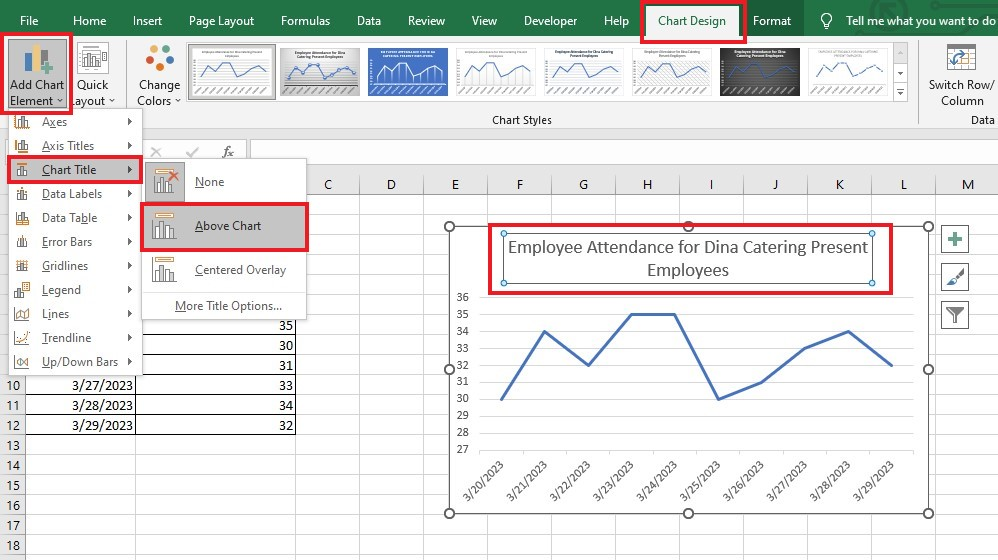
Format a Line Chart in Excel.
To format your line graph, right-click it and select Format Chart Area. Doing so will show you different chart elements that you can customize.
Format the Chart Title.
-
Go to the Chart Design tab, click Add Chart Element -> Chart Title -> Above Chart. You should see your chart title in Excel at the Top of your line graph.
-
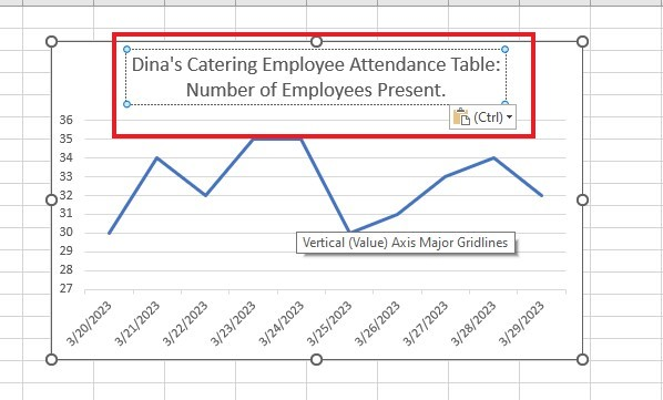
Edit the chart title.
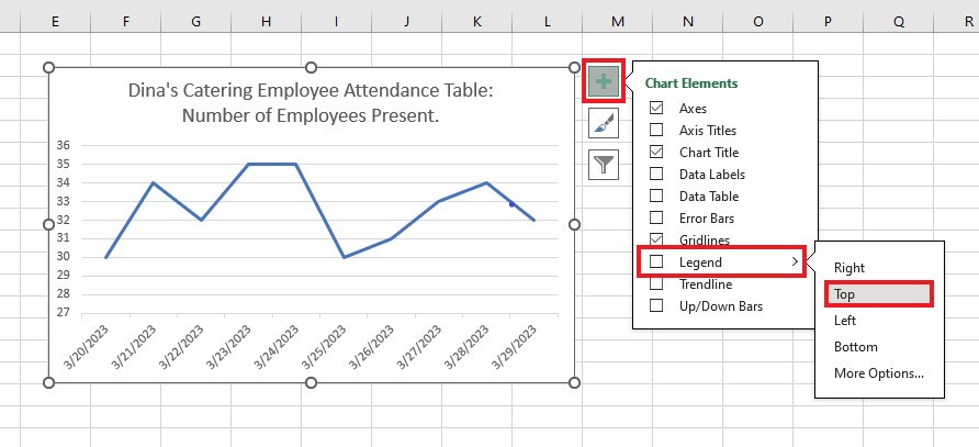
Add a Chart Legend.
-
Click the Chart Elements button and select the Legend element. From the drop-down menu, select Top.
-
Once you've done that, the Chart Legend will appear at the Top of your Chart.
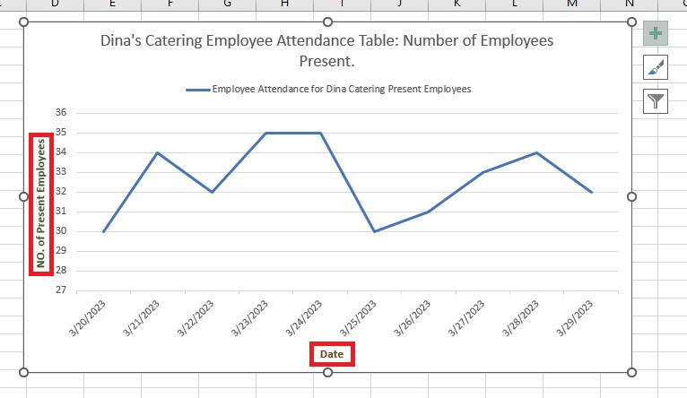
Format the Axis Title.
-
Click the Chart Elements Title and select Axis Titles. Doing so will add the Axis Titles section to your graph.
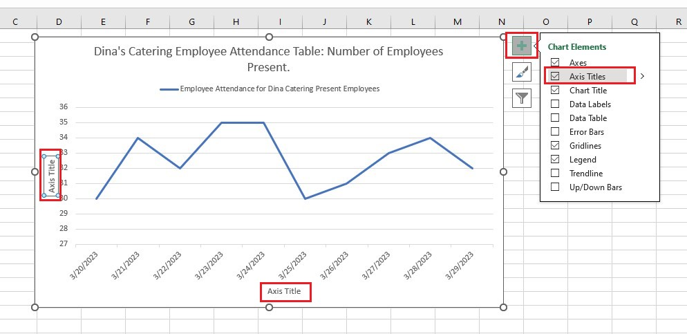
-
Edit the axis title.
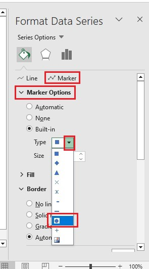
Format the Data Series.
-
Double-click the Chart to bring up the Format Data Series pane.
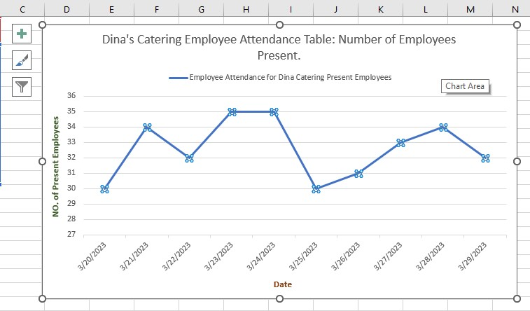
-
In the Format Data Series pane, choose Marker. From the Marker Options drop-down, choose Built-In. Select the circular icon under Type.
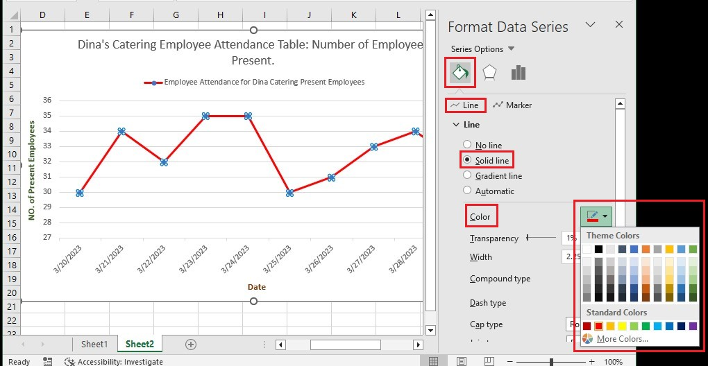
Format the Line Color.
-
Click the Fill -> Line. Then, from the drop-down options, select Solid Line and Color.
How to Make a Line Chart with Multiple Lines.
-
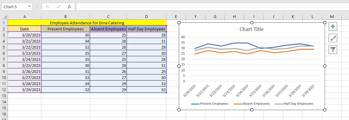
Select at least three columns of data.
-
Click the Insert tab and the Insert Line or Area Chart icon.
-
In the 2-D section, select the line graph.
You now have the line graph with multiple lines!
Final Thoughts on How to Insert Line Charts in Excel.
Now, you have the solution for boosting spreadsheet appeal! Make effective data presentations by customizing the parameters and colors of your line chart. You can even choose the line thicknesses and add labels for accurate reports.
For more easy-to-follow Excel guides, visit Simple Sheets. Get Excel and Google Sheets templates by reading the related articles below!
Frequently Asked Questions on How to Insert Line Charts In Excel:
Can I make individual line graphs for each row of my data?
Using the Excel Sparkline feature, you can create small line charts in a single cell. This function will help you see trends in data listed in rows.
How can I fade out the gridlines in my line graph?
-
In your line chart, click any gridline twice. The blue dots will appear at the end of each gridline to specify that all the gridlines are selected.
-
On the Fill & Line tab of the Format Major Gridlines pane, adjust the transparency level to 40%-75%.
Can I make smooth angles in my line chart?
Yes. You can follow these steps:
-
Click twice on the line you want to make smooth.
-
Go to the Format Data Series pane.
-
Go to the Fill & Line tab and check off the box that says "Smoothed Line."
Related Articles:
How to Overlay Graphs in Excel
Learn How to Make a Graph in Excel With These Simple Steps
How to Add a Trend-line in Excel Online
Want to Make Excel Work for You? Try out 5 Amazing Excel Templates & 5 Unique Lessons
We hate SPAM. We will never sell your information, for any reason.

