How to Overlay Graphs in Excel
Aug 09, 2022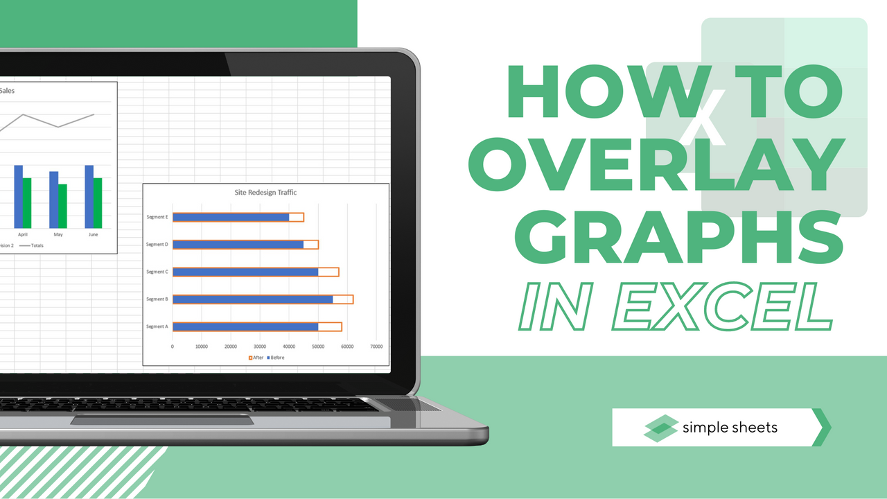
Last updated: August 25, 2026.
Quick answer: To overlay graphs in Excel, select your data, go to Insert > Recommended Charts > All Charts, then choose Combo. Set one series to Line and the rest to Clustered Column. If the two series use different scales, tick the Secondary Axis box beside the series you want on its own axis.
You can also watch this video to see how it is done if you are more of a visual learner.
Get our free Excel formulas cheat sheet
Plus new tutorials and template drops. Enter your email and we'll send it over.
On this page
- Overlay, combine, merge, superimpose: are they the same thing?
- How do you overlay two line graphs in Excel?
- How do you overlay a line graph on a column chart?
- How do you add a secondary axis?
- How do you combine two charts you have already made?
- How do you overlay a line graph with a scatter chart?
- How do you make bars overlap instead of sitting side by side?
- Which chart types can actually be combined?
- Why is your overlay chart not working?
- Frequently asked questions
Overlay, combine, merge, superimpose: are they the same thing?
Nearly, and the difference matters more than the words suggest. People searching for how to overlay, combine, merge, superimpose, layer, or overlap graphs in Excel are asking one of two different questions.
- "I have one data table and want both series in one chart." That is a combo chart. Build it once, from scratch, and you are done. Jump to the combo chart steps.
- "I already built two separate charts and want them as one." Different problem, different answer, and the answer is not what most people expect. Jump to combining two existing charts.
Rule to remember: Excel cannot merge two finished charts. It can only add another series to a chart that already exists.
Comparing two data sets in one chart is one of the most useful things Excel does. Actual revenue against target revenue, this year against last year, volume against price. Doing it as two separate clustered columns technically works, but it is slow to read. An overlay makes the comparison instant.
How do you overlay two line graphs in Excel?
If both series share the same scale, such as this year's sales and last year's sales in the same currency, you do not need a combo chart at all. A plain line chart with two series already overlays them.
- Select your entire data set, including the header row and both value columns.
- Go to the Insert tab on the Excel ribbon.

- Click Recommended Charts in the Charts group.
- The Insert Chart dialog box opens.
- Switch to the All Charts tab, where you can pick the exact type rather than accepting Excel's guess.
- Choose Line and then the line style you want.
- Click OK.
- Excel draws both series on one set of axes, overlaid.
If one line comes out flat along the bottom of the chart, the two series are on very different scales. That is the secondary axis problem, and it is covered two sections down.
Suggested read: How to Add Leading Zeros in Microsoft Excel
How do you overlay a line graph on a column chart?
This is the classic overlay: columns for the volume, a line for the rate or target sitting on top of them. It needs the Combo chart type.
- Select the data you want to plot, headers included.
- Go to the Insert tab.
- Click Recommended Charts in the Charts group.
- In the Insert Chart dialog, switch to the All Charts tab.
- Choose Combo at the bottom of the list on the left.
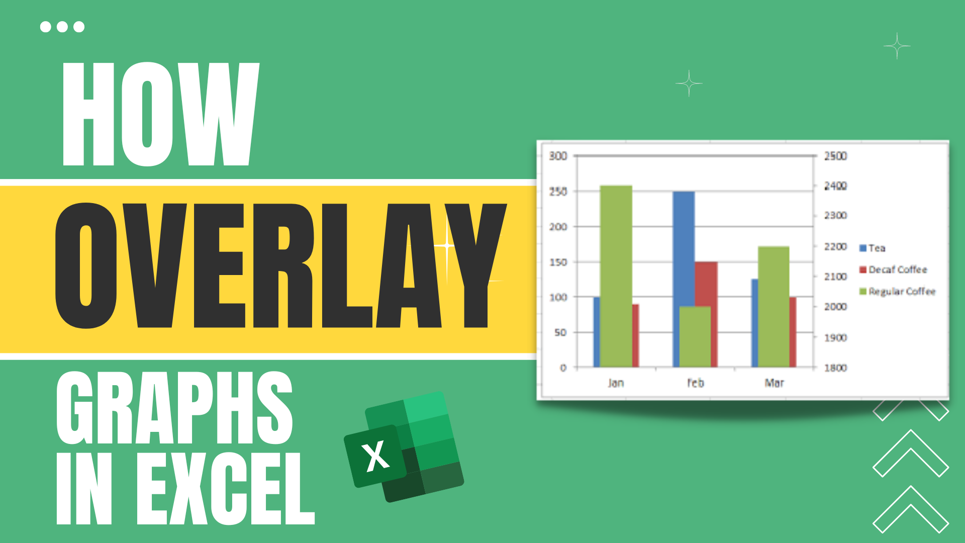
- In the Choose the chart type and axis for your data series panel, set the series you want as a line to Line, and leave the others as Clustered Column.
- Tick the Secondary Axis box beside the line series if its numbers are on a different scale from the columns. This is the step most tutorials skip, and skipping it is why so many overlay charts come out looking broken.
- Click OK.
- Adjust colours, labels, and axis bounds to taste.
Excel also ships a one-click preset for exactly this. In the Combo list, Clustered Column - Line on Secondary Axis does steps 6 and 7 for you.
Overlaying a cumulative line on bars is the core of a Pareto chart. See our pareto chart template, which has this built in.
Rule to remember: columns carry the volume, the line carries the rate, and the line almost always belongs on the secondary axis.

How do you add a secondary axis?
Use a secondary axis whenever the two series are measured in different units, or when one set of numbers is much larger than the other. Microsoft's guidance is the same: when values vary widely between series, or when you have mixed data types such as price and volume, plot one series on a secondary vertical axis.
Revenue in the tens of thousands plotted against a conversion rate between 0 and 5 will always look wrong on one axis. The rate flattens into the baseline and disappears.
On a chart you are building.
Tick Secondary Axis next to the series in the Combo panel of the Insert Chart dialog, as in step 7 above.
On a chart that already exists.
- Click the series you want to move so it is selected on its own.
- Right-click it and choose Format Data Series.
- Under Series Options, select Secondary Axis.
A second value axis appears on the right of the chart with its own scale. To remove it, repeat the steps and switch the series back to Primary Axis.
One caution worth stating plainly: a secondary axis lets you scale two series independently, which means you can make almost any two lines appear to move together. Set both axes deliberately rather than accepting whatever Excel picks, or the chart can imply a relationship that is not in the data.
Rule to remember: two axes means two scales, and two scales can manufacture a correlation. Set the bounds on purpose.
How do you combine two charts you have already made?
Here is the honest answer nobody leads with: Excel has no command that merges two chart objects. There is no Merge Charts button, and selecting both charts and grouping them only groups the pictures, not the data.
What you do instead is add the second chart's data as a new series on the first chart, then delete the second chart.
- Click the chart you want to keep.
- Go to the Chart Design tab and click Select Data. You can also right-click the chart and choose Select Data.
- Under Legend Entries (Series), click Add.
- In Series name, click the header cell of the data you are bringing over.
- In Series values, select the value range from the other chart's data.
- Click OK twice. The new series appears on the first chart.
- Set its chart type and axis: right-click the new series, choose Change Series Chart Type, and pick Line or Column, ticking Secondary Axis if the scales differ.
- Delete the now redundant second chart.
A shortcut when both charts read from the same block of cells: click the chart, and Excel highlights its source range on the worksheet with a coloured border. Drag the corner handle to include the extra column, and the series is added without opening any dialog.
If you genuinely want two chart pictures stacked on top of each other, which is occasionally what "superimpose" means, you can set the upper chart's Format Chart Area > Fill > No Fill and drag it over the lower one. Be careful with this. The two charts keep separate axes that will not line up, so the result usually misleads. Adding a series is nearly always the right answer.
Rule to remember: to merge two charts, add a series to one of them. Do not try to stack the pictures.
Suggested read: Everything You Need to Know About the Sunburst Chart In Excel
How do you overlay a line graph with a scatter chart?
Useful when you have measured points plus a modelled or target curve, and you want both on one plot.
- Select your entire data set and go to the Insert tab.
- Click Recommended Charts in the Charts group.
- In the Insert Chart dialog, select the All Charts tab.
- Choose Combo.
- Set the first series to Line and the second to Scatter with Smooth Lines and Markers.
- Click OK and adjust from there.
One thing to watch: line charts treat the horizontal axis as evenly spaced categories, while scatter charts treat it as real numbers. If your x values are unevenly spaced, such as measurements at 1, 2, 5 and 20 minutes, make both series scatter types instead of mixing line and scatter. Otherwise the line series will space those points evenly and misrepresent the data.
Rule to remember: a line chart spaces the x axis evenly, a scatter chart does not. Do not mix them when the x values are uneven.
How do you make bars overlap instead of sitting side by side?
Different meaning of overlay, and a common one. Clustered columns sit next to each other by default. To make them physically overlap, so one bar sits partly in front of another:
- Right-click any column in the series and choose Format Data Series.
- Under Series Options, find the Series Overlap slider.
- Drag it towards 100 percent. At 100 percent the bars sit exactly on top of each other, at 0 percent they touch, and at negative values they separate.
- Adjust Gap Width in the same panel to control the space between category groups.
A useful pattern for actual against target: set Series Overlap to 100 percent, then make the target series narrower or set it to no fill with a coloured border so the actual bar reads as a fill level inside it.
Rule to remember: Series Overlap controls bars within a group, Gap Width controls space between groups.
Which chart types can actually be combined?
Excel's Combo dialog only offers the classic chart types for each series. Several chart types simply cannot participate, and knowing which saves a lot of hunting through the drop-down.
| Combination | Works in Combo? | Good for |
|---|---|---|
| Clustered Column and Line | Yes, and it is a built-in preset | Volume with a rate or target on top |
| Stacked Column and Line | Yes | A total broken into parts, plus a trend line |
| Area and Line | Yes | A range or band with an actual value inside it |
| Column and Scatter | Yes | Grouped totals with individual measured points |
| Line and Scatter with Smooth Lines | Yes | Measured points against a modelled curve |
| Pie or Doughnut with anything | No | Not supported as a combo series |
| Sunburst, Treemap, Histogram, Box and Whisker, Waterfall, Funnel | No | These newer types cannot be combo series either |
If you need a pie alongside a bar chart, build them as two separate charts and place them side by side. That is a layout job, not a chart job.
Why is your overlay chart not working?
| Problem | Cause | Fix |
|---|---|---|
| One series is a flat line along the bottom | The two series are on wildly different scales | Put the smaller series on the Secondary Axis |
| Combo is greyed out or missing | Only one data series is selected | Reselect the range so it includes at least two value columns |
| Pie or sunburst is not in the series drop-down | Those types cannot be combo series | Build them as separate charts placed side by side |
| The line is hidden behind the columns | Series plot order | Select Data, use the arrows to move the line series down the list, or put it on the secondary axis |
| Two charts will not merge | Excel has no merge command for chart objects | Use Select Data, Add to bring the second series onto the first chart |
| Bars sit side by side, not overlapping | Series Overlap is at 0 or below | Format Data Series, drag Series Overlap towards 100 percent |
| Category labels are wrong after adding a series | The horizontal axis range did not update | Select Data, Edit under Horizontal (Category) Axis Labels |
| The secondary axis makes the trends look identical | Excel auto-scaled both axes independently | Format Axis, set the minimum and maximum bounds by hand |
Final thoughts
Almost every overlay chart problem in Excel is one of two things: the reader needed a combo chart and built two charts instead, or they built the combo chart and skipped the secondary axis. Get those two right and the rest is formatting.
Visit our home page for more step-by-step guides, or browse the full library of Excel tutorials.
Suggested read: Basic Microsoft Excel Formulas You Need to Know
Suggested read: How to Get Microsoft Excel for Mac
Frequently asked questions
How do you overlay two graphs in Excel?
Select both data series, go to Insert, Recommended Charts, All Charts, and choose Combo. Set one series to Line and the other to Clustered Column, then tick Secondary Axis if the two series use different scales. Click OK and both appear on one chart.
How do you combine two existing charts in Excel?
Excel cannot merge two chart objects. Click the chart you want to keep, go to Chart Design, Select Data, and click Add under Legend Entries. Point Series name at the header cell and Series values at the data range from the other chart, then delete the second chart.
How do you add a secondary axis to an Excel chart?
Click the series you want to move, right-click it, choose Format Data Series, and select Secondary Axis under Series Options. When building a combo chart you can instead tick the Secondary Axis box beside the series in the Insert Chart dialog.
Where are the chart types in Excel?
They are on the Insert tab, in the Charts group. Click Recommended Charts and then the All Charts tab to see every chart type Excel offers, rather than only the ones it suggests for your selection.
Can you combine a pie chart with a bar chart in Excel?
No. Pie and doughnut charts cannot be used as a series in a combo chart, and neither can the newer types such as sunburst, treemap, histogram, waterfall, and box and whisker. Build them as two separate charts and place them side by side.
Why does one line look flat when I overlay two graphs?
The two series are on very different scales, so the smaller one is compressed against the axis. Put the smaller series on a secondary axis, which gives it its own scale on the right-hand side of the chart.
How do you make two bars overlap in Excel?
Right-click a column in the series, choose Format Data Series, and drag the Series Overlap slider towards 100 percent. At 100 percent the bars sit directly on top of each other. Gap Width in the same panel controls the space between category groups.
Related Articles:
Excel: Remove Trailing Spaces Quickly and Easily With These Simple Steps
Excel Repeat Last Action: What is it and How Does it Work?
Want to Make Excel Work for You? Try out 5 Amazing Excel Templates & 5 Unique Lessons
We hate SPAM. We will never sell your information, for any reason.