
The Sunburst Chart In Excel: Everything You Need to Know
Mar 14, 2023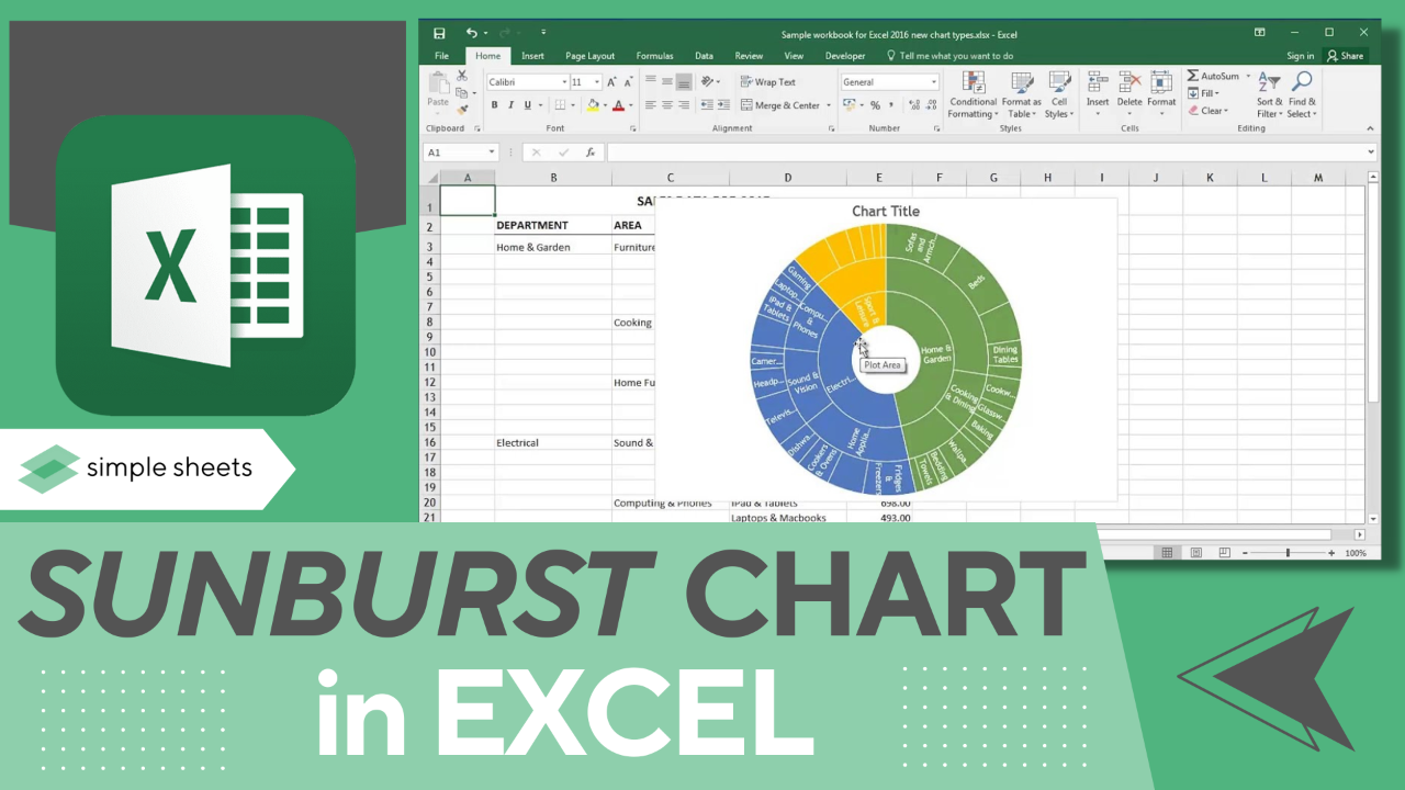
Are you looking for the best chart for your hierarchical data?
The sunburst chart in Excel is an excellent option! The radial design of this particular chart tool makes it an excellent choice when trying to convey multiple levels of information in an easy-to-digest format.
Read on as we cover the following:
-
What is an Excel sunburst chart?
-
How to make a sunburst chart in Excel.
-
Final thoughts on sunburst charts In Excel.
-
Frequently asked questions on sunburst charts In Excel.
Read Also: How To Make A Line Graph In Excel-EASY Tutorial
What are Excel Sunburst Charts?
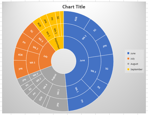
A sunburst chart in Excel is a hierarchical chart, also known as a ring chart or a radial treemap. A sunburst partition chart displays hierarchical data excellently as each category explores deeper hierarchy levels.
The sunburst chart is easy to read because it resembles a pie or doughnut chart, making it easy to understand and visualize each data point.
How to make a Sunburst Chart in Excel.
-
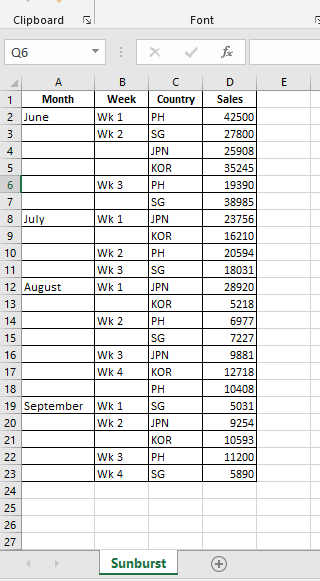
Prepare your data table.
-
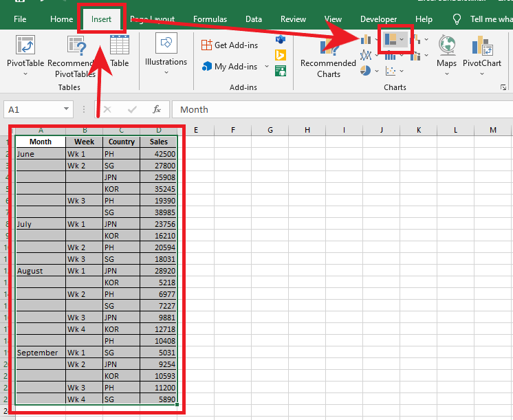
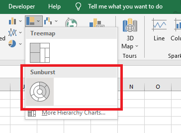
Select your data set, go to the Insert tab, and select the Insert Hierarchy Chart in the Charts Group.
-
In the Insert Hierarchy Chart drop-down menu, choose Sunburst Chart.
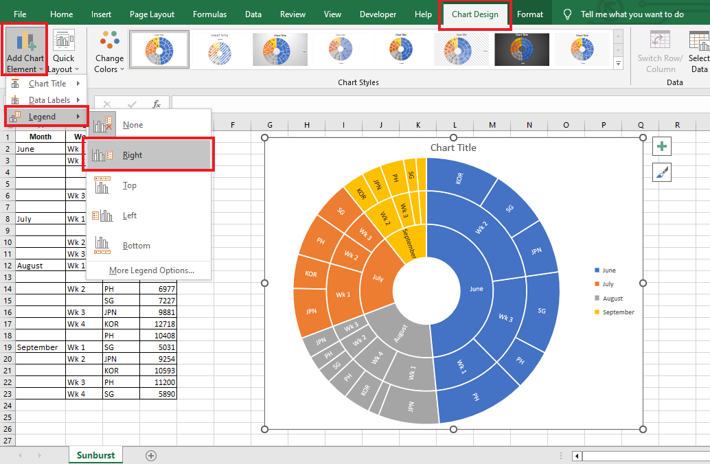
For better data visualization, navigate to Chart Design.
-
Go to the Add Chart Element, click Legend, and in the Legend drop-down menu, you can choose where to put your Legend Chart Element.
-
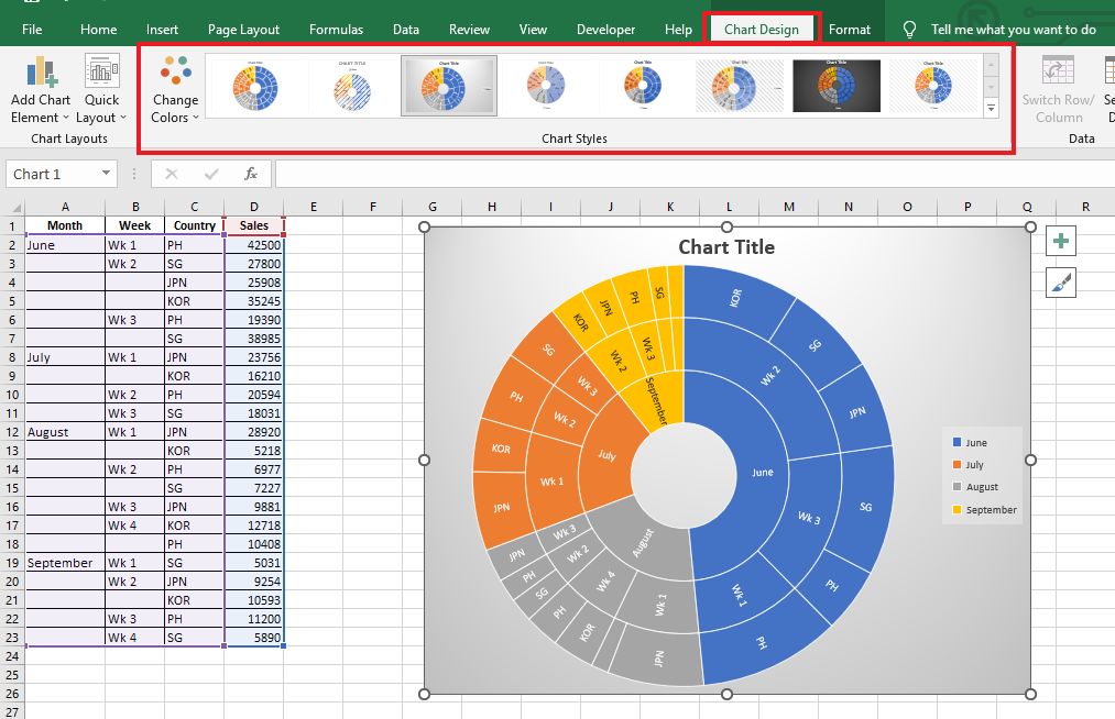
Choose a Chart Style.
-
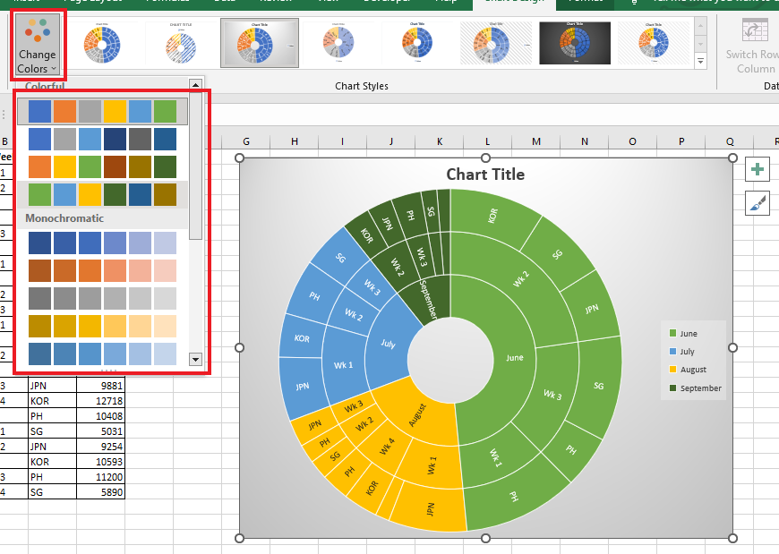
Choose a Chart Color to correspond with your vital data points.
Read Also: How to Group Dates in Pivot Tables in Excel
The multiple layers represent the inner rings, the outer ring which the inner rings representing the top-level data, and the outer ring represents the relationship to the inner circle.
Final Thoughts on Sunburst Chart In Excel.
Now you're ready to make your sunburst chart in Excel!
It offers viewers a visually appealing and eye-catching experience and helps reveal detailed information, even in complex datasets. If you're visualizing categorical counts — like defect types collected in a tally sheet template — a sunburst makes the hierarchy of categories instantly readable.
You can visit our home page for more easy-to-follow how-to and step-by-step guides. Check the links in related articles for further details about Excel/Google Sheets Templates!
Frequently Asked Questions on Sunburst Charts In Excel:
Is there a sunburst chart generator I can use?
If you want to avoid manually making a sunburst chart in Excel, the Chart Expo can help you. This is a third-party add-on that many professionals use for sunburst charts.
Are there any disadvantages to using sunburst charts in Excel?
It can take time to understand the information immediately. Angles are confusing, so sunburst charts like pie or donut charts can be challenging to read.
Related Articles:
What is a Sunburst Chart and When to Use a Sunburst Chart in Excel
How to Overlay Graphs in Excel
How to Connect Slicers to Multiple Pivot Tables
Want to Make Excel Work for You? Try out 5 Amazing Excel Templates & 5 Unique Lessons
We hate SPAM. We will never sell your information, for any reason.

