
Learn How to Make a Graph in Excel With These Simple Steps
Jan 25, 2023
If you need help making a graph in Excel, fear not! Making a graph with this tool is relatively easy. Creating charts can provide insight into manual data entry trends and relationships that would be much easier to explain with one.
Whether trying to analyze sales figures, study scientific phenomena, or track stock market performance, learning to make a graph in Microsoft Excel will allow you to showcase your data with recommended charts effectively. Keep reading for instructions on how to make a basic Excel graph.
Suggested read: Why Microsoft Excel Cannot Paste the Data
Importance of the Graph Feature in Excel
Graphs are critical components in Microsoft Excel software. They allow users to create visual representations of data quickly and easily.
Analysts can use a graph to design and format tabs for data management and create graphs that accurately depict the underlying statistics.
This tool is a great way to compare different data sets across multiple categories, understand trends better, or locate outliers quickly. Moreover, graphs allow you to create more informative data reports that would otherwise be impossible without them. Spotting outliers visually is also the core idea behind a quality control template, where defect counts get plotted to surface trends fast.
Mastering graph tools will enable better data representation, leading to more informed decisions when working with large datasets in Excel.
How to Make a Graph in Excel
Making a graph in Excel is essential for presenting your data effectively and clearly. Follow these steps to create your graph:
Step 1. Open Microsoft Excel.
Step 2. Click on the "Insert" tab.
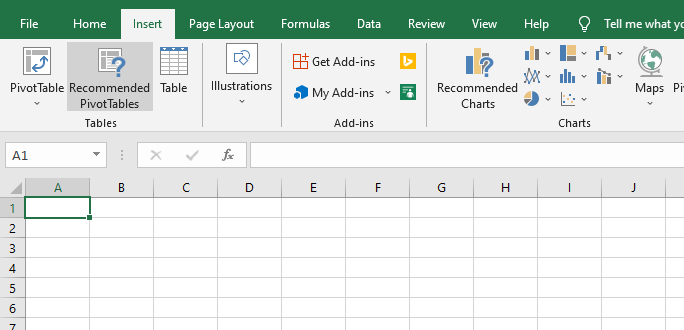
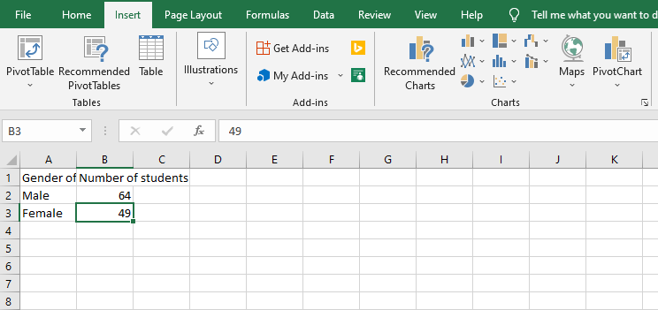
Step 3. Type and select data
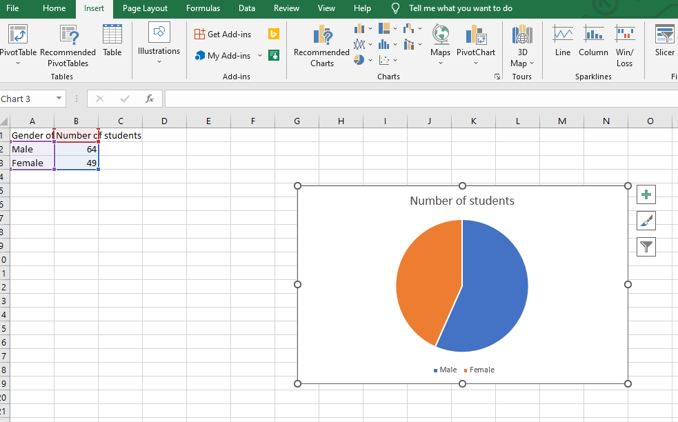
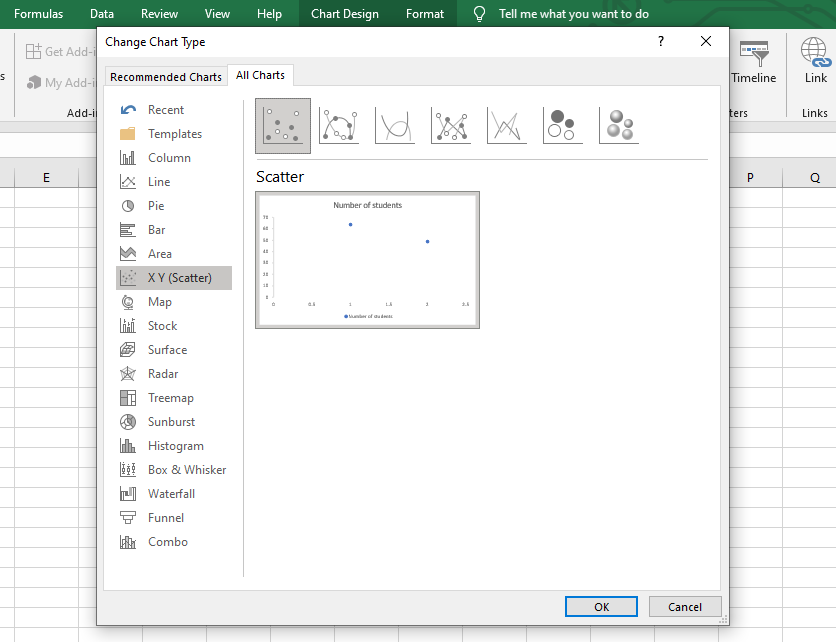
Step 4. Click on the type of graph you want to create.
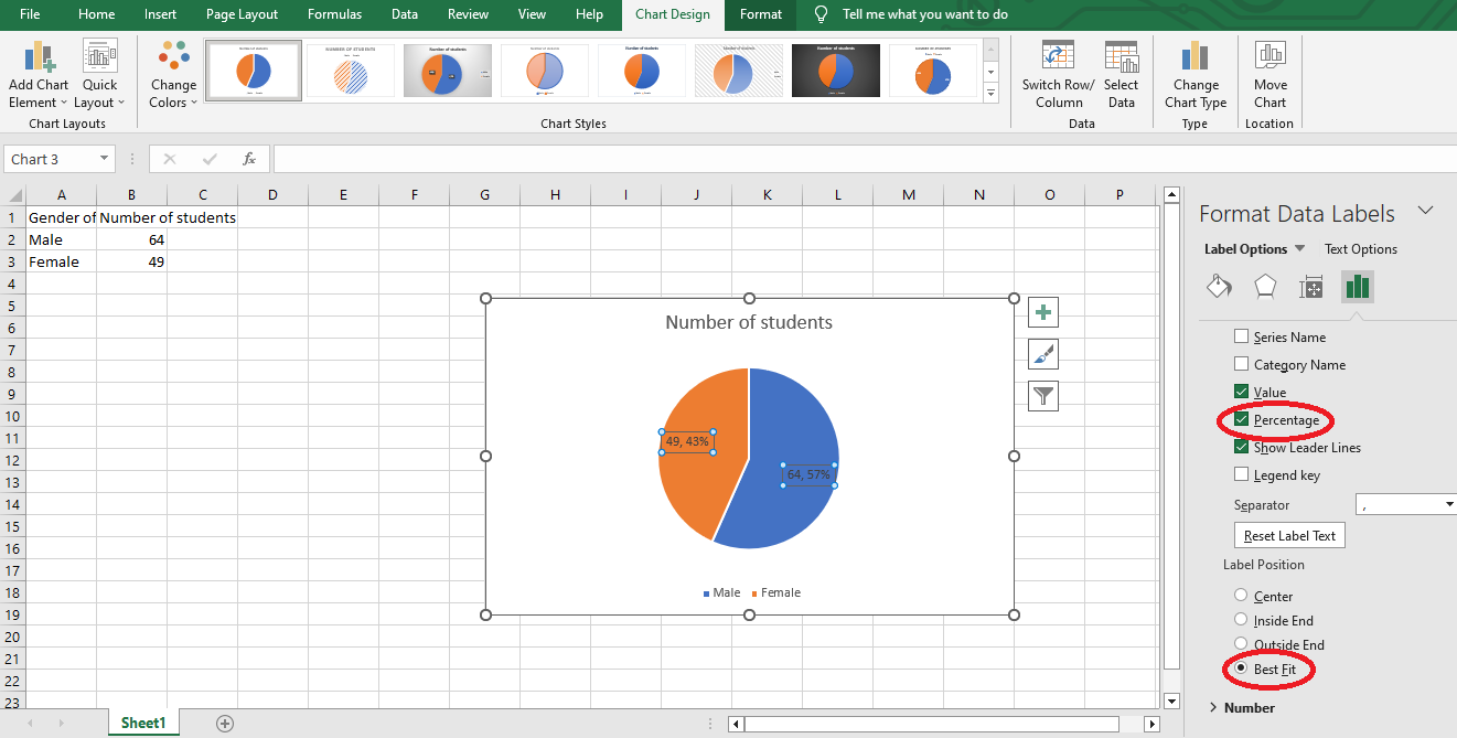
Step 5. Click the "Chart Element" button and click "Data Labels."
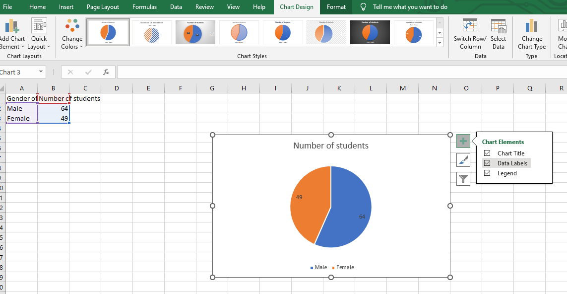
Step 6. Go to "Add Chart Elements," then "Data Label," and lastly to " More Data Label Options."
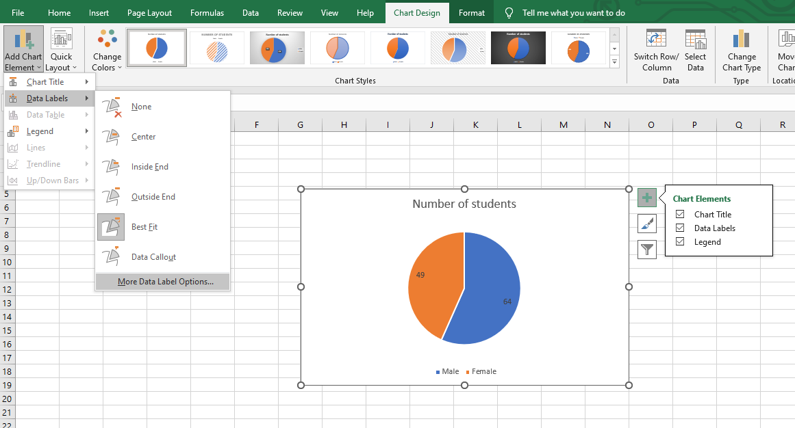
Step 7. When "Format Data Labels" shows, click "Percentage" and "Best Fit."
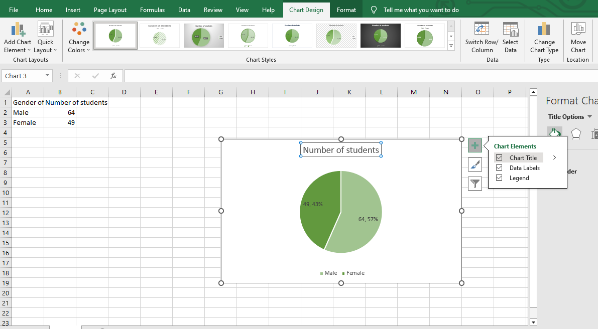
Step 8. Add Chart Title
Type in the data you want in your graph, starting with the x-axis (horizontal axis) and then the y-axis (vertical axis).
The best ways to visualize your graph in Excel information and make meaningful conclusions. To start, open up, click "New," and create a new sheet. First, type in the x-axis data that you want to graph. This horizontal axis typically includes categories, such as when you have a graph.
The y-axis (vertical axis) will contain the values associated with each category on the x-axis (horizontal axis). With all your data typed in, you're now ready to graph it."
Suggested read: Excel Repeat Last Action: What is it and How Does it Work?
Which Graph Should I Use?
Deciding which type of graph to use when visualizing data can be complex. The most commonly used graphs are bar charts, line graphs, and pie charts, each with advantages and disadvantages.
When choosing the type of graph you want to create, your decision should depend on the data you are trying to display.
If you want to compare different values over time, such as sales figures for an entire year, then a line graph might be ideal for showing how those numbers have changed.
For example, if you wanted the company's yearly growth of its revenue, then displaying it in a line graph would provide viewers with an accessible overview of that progress.
However, a bar or pie chart could prove more effective if you need to portray the distribution among different categories.
For example, if you wanted to show what proportion of sales were made by each product from a specific manufacturer within a quarter, then this type of data would be best presented with a bar or pie chart.
Understanding the pie chart and what information you intend to convey is critical when selecting which graph best suits your purposes.
The three most common graphs used are:
- Bar Graph
- Line Graph
- Pie Graph
1. Bar graph.
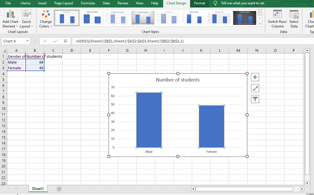
Bar graphs are a standard visual tool used to digest data easily. They offer users the advantage of seeing a large amount of data at one time, but one disadvantage is that these graphs can be difficult to read with complex data sets.
When creating an Excel bar graph, you should never include chart titles, axis labels, vector-based images, and data labels when applicable.
It is also essential to carefully select the data points you want to use to create the most effective graph. By doing so, you can effectively display the results in a comprehension manner.
2. Line graph.
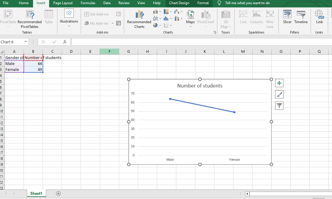
A Line graph is one of the most commonly used visualizations for displaying data. They typically feature a line connecting individual points to show the progress or trend of a variable over time.
Line charts have a horizontal axis representing the x-axis and a vertical axis representing the y-axis. This x/y notation allows readers to easily visualize or compare data values within the line graph.
The data is always represented in line charts through a data table that includes numerical points for coordinates along both axes; line segments then connect these coordinates to illustrate trends in the data.
With line graphs, readers can visualize data changes more clearly than simply reading from a table, making a line graph an effective way to display data.
3. Pie graph.
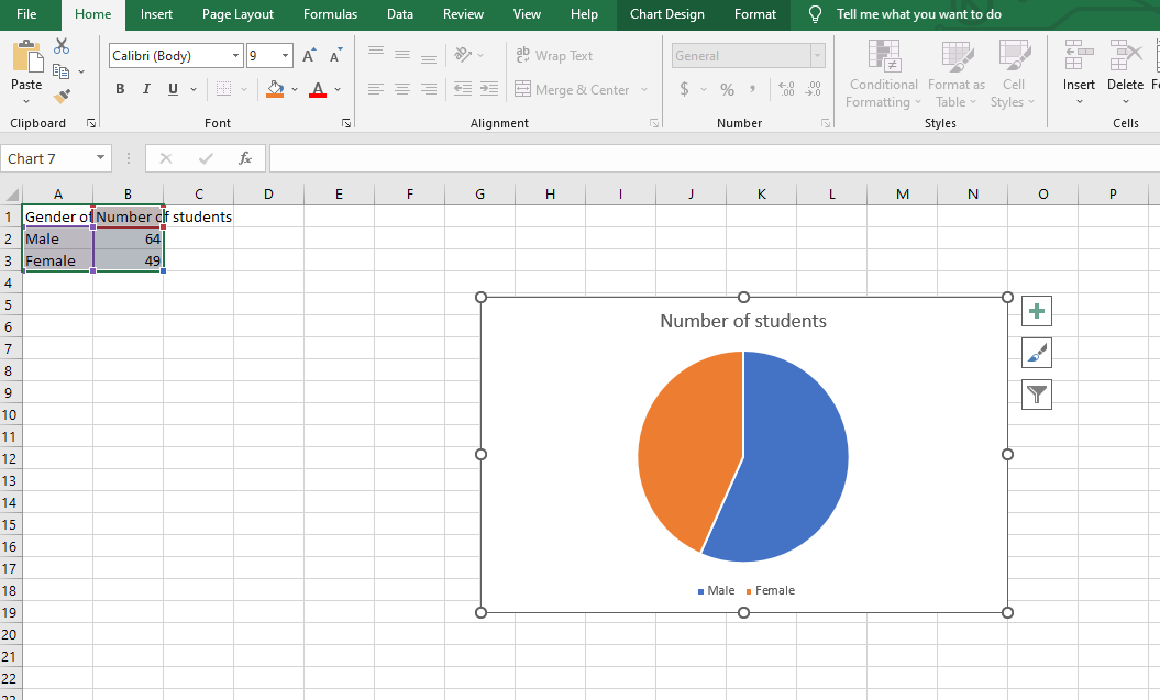
Pie graphs are one of the most helpful chart options for showcasing select data visually in an appealing way. Pie charts allow you to select specific data, map out its chart elements and visualize the data trends effectively.
Creating a pie chart not only aids in a better understanding of choosing a lot of data label and their directions but also helps to highlight any signs or signals of change in those trends - vital information for understanding any number of factors.
When selecting data set, a pie chart is the best method for quick analysis, providing integrated, visual insight into particular data point elements quickly and efficiently.
Different Kinds of Excel Charts
Many other graph types beyond the classic Pie, Line, and Bar charts can be used. For example, a graph in Excel, found in Microsoft Office Suite products like Excel, Word, and PowerPoint, can contain various chart tools.
With these different charts and graph tools, you can create any visual don't representation. You don't need to use graph software or applications since experts have already created pre-made Excel charts that one can easily access online!
All these variations make it easy to present complex data in a way that's visually engaging for anyone who needs to understand it.
Customizing Your Graph
Making a graph on a computer is easy enough, but how do you get it to stand out and be something worth noticing? Customizing your chart by adjusting the colors, labels, and axes can make it more visually appealing and help with interpretability.
For example, changing the color of the bars or dots in a bar graph can highlight specific data points others may otherwise overlook.
Additionally, using concise and descriptive labels for the different parts of the chart can give extra detail that will help when discussing it in presentations or reports.
Adjusting your axes' scale can also ensure that your data looks its best! You can make a custom graph exclusively for you with these simple adjustments.
Saving and Printing Your Graph
Graphs can be tremendously helpful for organizing large amounts of data and providing a visual representation of trends. Many applications allow users to create a chart quickly. Still, they then need to provide more options for users to save their work for later or share it with others.
Keeping your graph is advantageous because it allows you to refer back to it whenever needed, either for further analysis or as a reference point.
Saving your graph can help you in the future to check previous results or even use it in other applications.
Furthermore, you may want to share it with someone else. In that case, you can easily print a copy of the graph in high-quality resolution.
It is a simple and convenient way to ensure that hard work on your graph and data analysis are available when needed.
Final Thoughts on How to Make a Graph in Microsoft Excel
Creating a graph in Excel is easier a task than one might think. With just a few steps and some guidance, anyone will soon be making graphs with ease. The possibilities of what you can create are endless - from the simple line, charts don't elaborate 3-D bubble charts!
Furthermore, customizing them can give your data some added zing with labels, fonts, and colors that best convey the story behind your findings.
You'll practice and experiment, and you'll be creating stunning graphs with ease! The best part is that these tips provide a foundation to continue building your knowledge as you gain experience using Excel.
Experienced Excel users can experiment with even more advanced features and options to enhance their graphs and make them stand out. Now that you know about making Excel graphs, it's time to start creating!
Suggested read: Excel Pivot Table Training: Everything You Need to Know
Frequently Asked Questions:
How to make a graph in Excel?
Once your data is ready, navigate to the 'Insert' tab, select 'Charts,' and choose the graph that best represents your data.
How do I add data to my graph in Excel?
Once you select your desired graph type, it will automatically plot with all information within the chosen data range. If you want to customize it further with titles, legends, or axis labels, click individual components and edit them accordingly.
How do I format my graph in Excel?
It comes down to understanding the tools available in the Home Tab of the Ribbon, found above your worksheet.' When you click on 'Format Selection' from this tab, it will bring up a pane on the right side of your screen,
It will allow you to customize various formatting options, such as chart element positions and font size.

Related Articles:
First Excel Live Training Video and Notes!
Microsoft Forms 101 and How To Integrate with Microsoft Excel
Want to Make Excel Work for You? Try out 5 Amazing Excel Templates & 5 Unique Lessons
We hate SPAM. We will never sell your information, for any reason.

