
Beginners Guide: How To Insert Column Charts In Excel
Mar 21, 2023
Are you looking for a way to make your data more understandable and your visuals more impactful?
This blog post explains how to insert column charts in Excel. This feature will give you a more organized data set and make your reports compelling and engaging.
Read on as we cover the following:
-
What Is a Column Chart in Excel?
-
Kinds of Column Charts
-
Insert a Column Chart in Excel
-
Customize Column Charts in Excel
-
Final Thoughts on How to Insert Column Charts in Excel
-
Frequently Asked Questions on How to Insert Column Charts in Excel
Read Also: How To Make A Line Graph In Excel-EASY Tutorial
What Is a Column Chart in Excel?
Column graphs or charts display different categories of data with rectangular figures. The length of the figures is based on the size of the data categories they represent.
You can plot the bar graphs vertically or horizontally. In Excel, a vertical bar graph is called a column bar chart.
Kinds of Column Charts.
Clustered Column Chart.
A clustered column chart in Excel shows different sets of data. All the data sets share the same labels while arranging the bars by category.
You can compare multiple sets of data with a clustered chart. So, you can see how the data changes over time. But be careful - too many data sets make it difficult to visualize on the chart.
Stacked Column Chart.
A stacked column chart shows how much each component comprises the total. Consequently, you will see how everything adds up.
It is hard to compare the different data parts with each other. Thankfully, stacking helps you show how the data are related.
100% Stacked Column Chart.
A 100% stacked column chart lets you show the comparable percentage of multiple data series in stacked columns. Remember that the total of stacked columns is always equal to 100%.
Read Also: How Do I Make Two Graphs Overlap in Excel?
Insert a Column Chart in Excel.
-
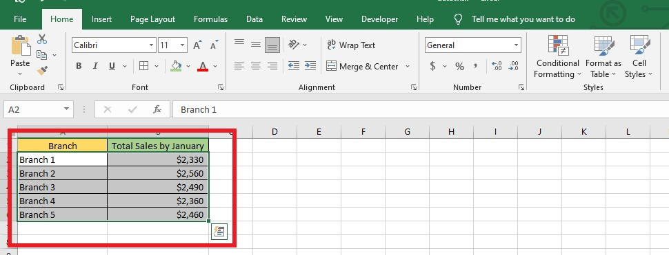
Select data from the data table.
-
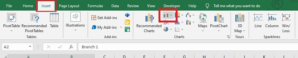
Look for the Insert tab and select Insert Column or Bar Chart from the Charts group.
-
Select Clustered Column chart from the 2-D columns drop-down menu.
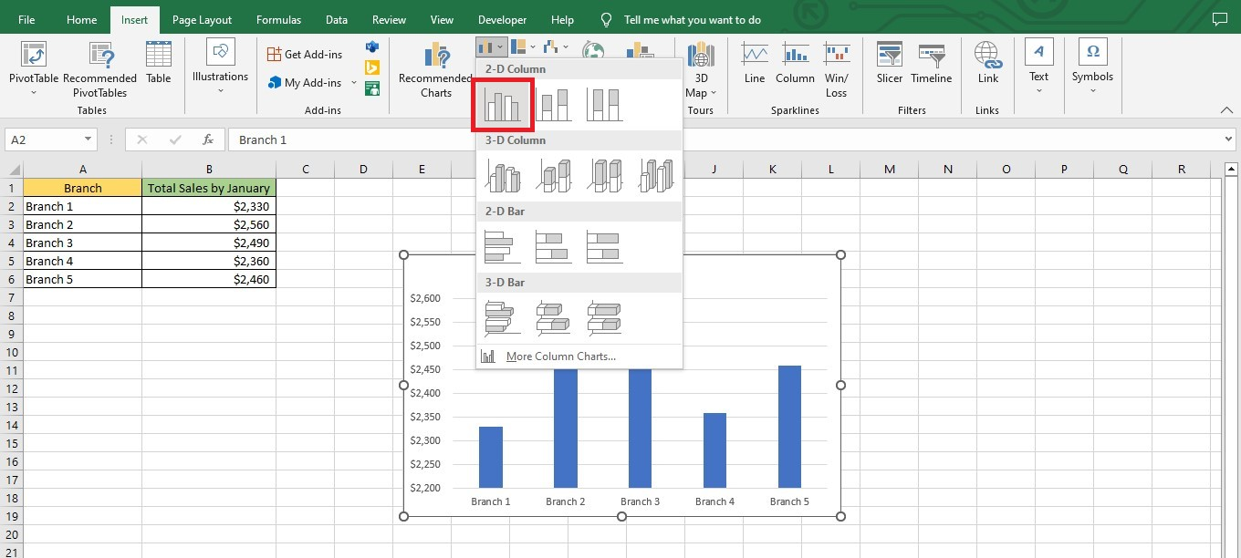
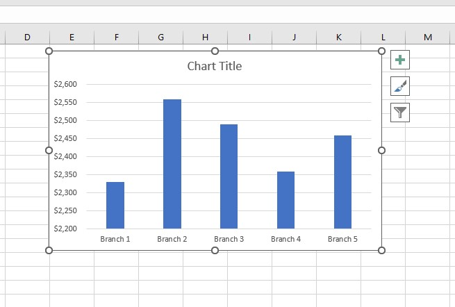
You now have a basic column chart. As you can see, making one takes a few simple clicks.
Customize Column Charts or Bar Charts in Excel.
To customize an entire chart, follow these instructions:
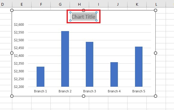
Format the Chart Title.
-
Select the chat title text box.
-
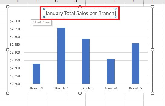
Rename the chart title.
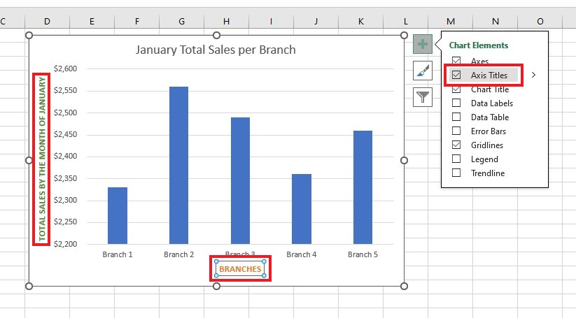
Add Chart Axis Titles
-
Click the Chart Elements icon and select Axis Titles.
-
Rename the axis titles.
Read Also: How to Remove Formula And Keep Value in Google Sheets
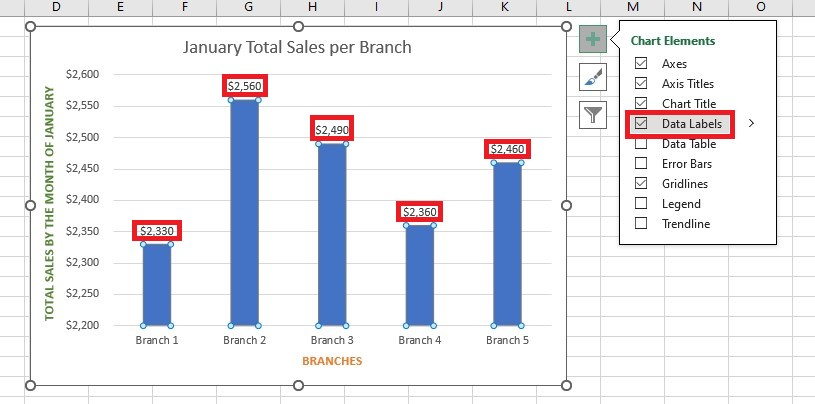
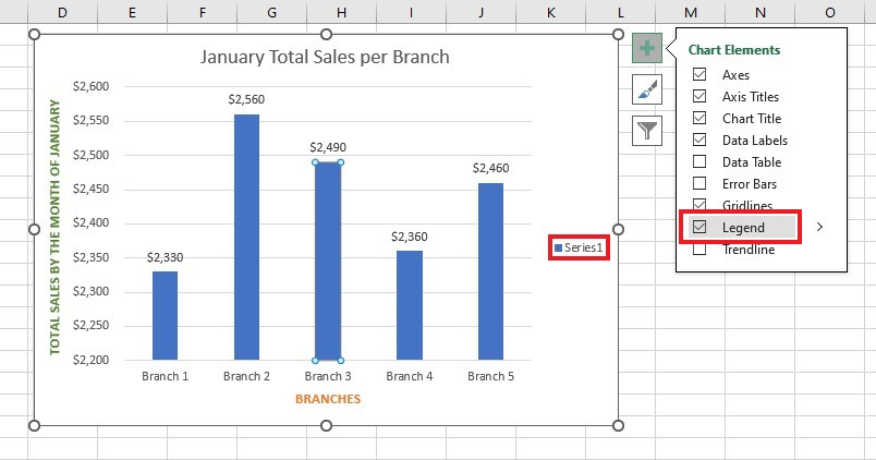
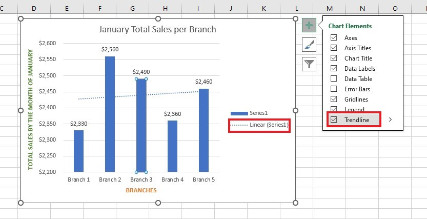
Add a Column Chart Legend, Axis Titles, and Trendline.
-
In the Chart Elements menu, click Data labels. Add the values of each bar or column.
-
Select Legend under the Chart Elements menu.
-
Select Trendline from the Chart Elements options.
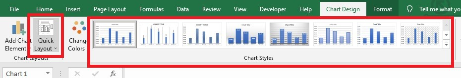
If you want to change how your bar graph looks on your Excel sheet, click on it. Then, go to the Chart Tools tab. You can perform customizations using the tools in the Design tab:
-
Click the Quick Layout button in the Chart Layouts group to try different bar graph layouts or
-
Use the features in the Chart Styles group.
Read Also: How to compare two Excel files or sheets for differences
Final Thoughts on How to Insert Column Charts in Excel.
That's it! You have everything you need to insert column charts in Excel! Whether you are a professional, student, or simply someone who likes to use spreadsheets for fun, learning to create data visualization can be beneficial.
For more easy-to-follow Excel guides, visit Simple Sheets. Get Excel and Google Sheets templates by reading the related articles below! For quality teams tracking defects, our defect tracking template uses column charts with auto-updating data.
Frequently Asked Questions on How to Insert Column Charts in Excel:
When should I not insert a column chart?
Avoid using column charts and find an alternative chart when you're processing the following:
- An extensive amount of data
- Cumulative values
- Small values and percentage rates
How can I change the arrangement of the data labels in my column chart?
To move data labels, click them once. Double-click to select a specific label. Then, click the Labels arrow and choose where you want it to go.
Can I modify the spacing between the bars in my column graph in Excel?
Yes. You can follow these steps:
- Click the right side of any of the colored bars.
- Choose Format Data Series in the list that comes up.
- Make the gap smaller.
Note: Excel column graphs' gap or space width usually starts at 150%.
Related Articles:
Learn How to Make a Graph in Excel With These Simple Steps
Excel Cycle Plot Chart: What is It and How to Use It
How to Add a Trendline in Excel Online
Want to Make Excel Work for You? Try out 5 Amazing Excel Templates & 5 Unique Lessons
We hate SPAM. We will never sell your information, for any reason.

