
Excel Cycle Plot Chart: What is It and How to Use It
Feb 15, 2023
Do you want to display a complex set of data in a way that quickly communicates meaningful insights and relationships between different factors?
If so, an Excel cycle plot chart might be what you're looking for.
In this article, we'll go over the following:
-
What an Excel Cycle plot chart is.
-
How to make an Excel Cycleplot chart.
-
Final thoughts on Excel cycle plot charts.
What is an Excel Cycle Plot Chart?
Excel cycle plot charts help track and visualize cycle-styled trends over time through an Excel worksheet. Depending on the cycle you're tracking, they are created by inserting cells for each cycle occurrence in a row or column.
For example, monthly sales or seasonal temperatures are cycle data that fit into this chart style. The cycle plot chart requires two columns or rows of numbers representing the cycle values and the year, respectively.
With the cycle values in one row and the year in another, Excel automatically creates a cycle graph showing how the value changes throughout each cycle period.
The result is an easy-to-read visual representation of how cycle trends change over time. Cycle plot charts are perfect for individuals or teams who require an efficient way to keep track of results in style!
Read Also: What's the Difference Between Excel Workbook & Worksheet?
How to Make an Excel Cycle Plot Chart
A cycle plot is useful for visualizing data with a seasonal or cyclical pattern over time. Here's a step-by-step guide to creating a cycle plot chart in Excel:
-
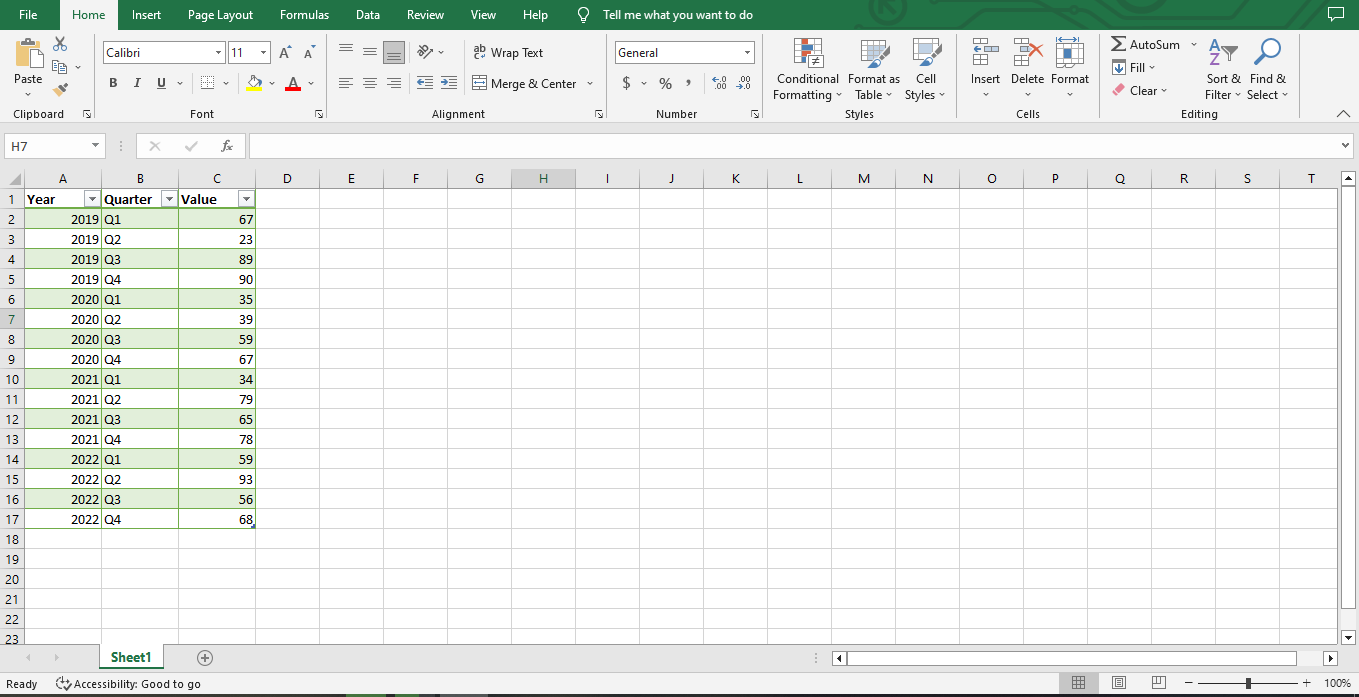
Start by preparing your data for plotting.
-
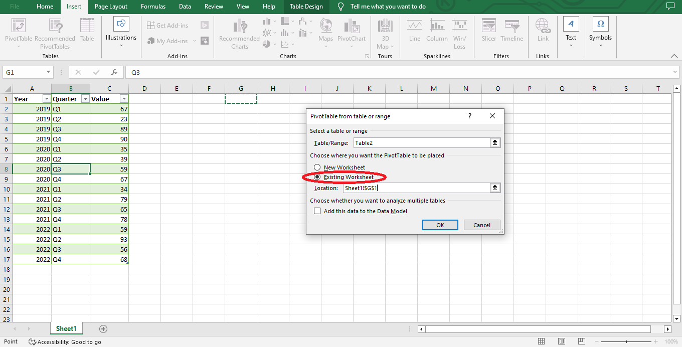
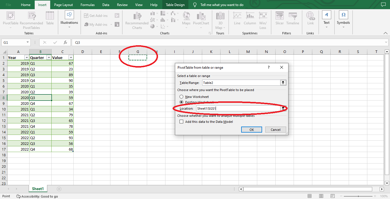
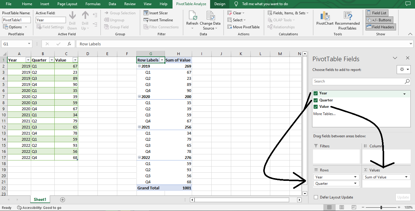
Go to the Insert Tab and put the data into a Pivot Table.
-
Select a cell where you want to put your pivot table and click the OK button.
-
After the PivotTable Fields pop-up appears, address the "Year and Quarter Table" to the Rows Section below, the "Sum Value" Table to the Values Section below, and your data will be present in your worksheet.
-
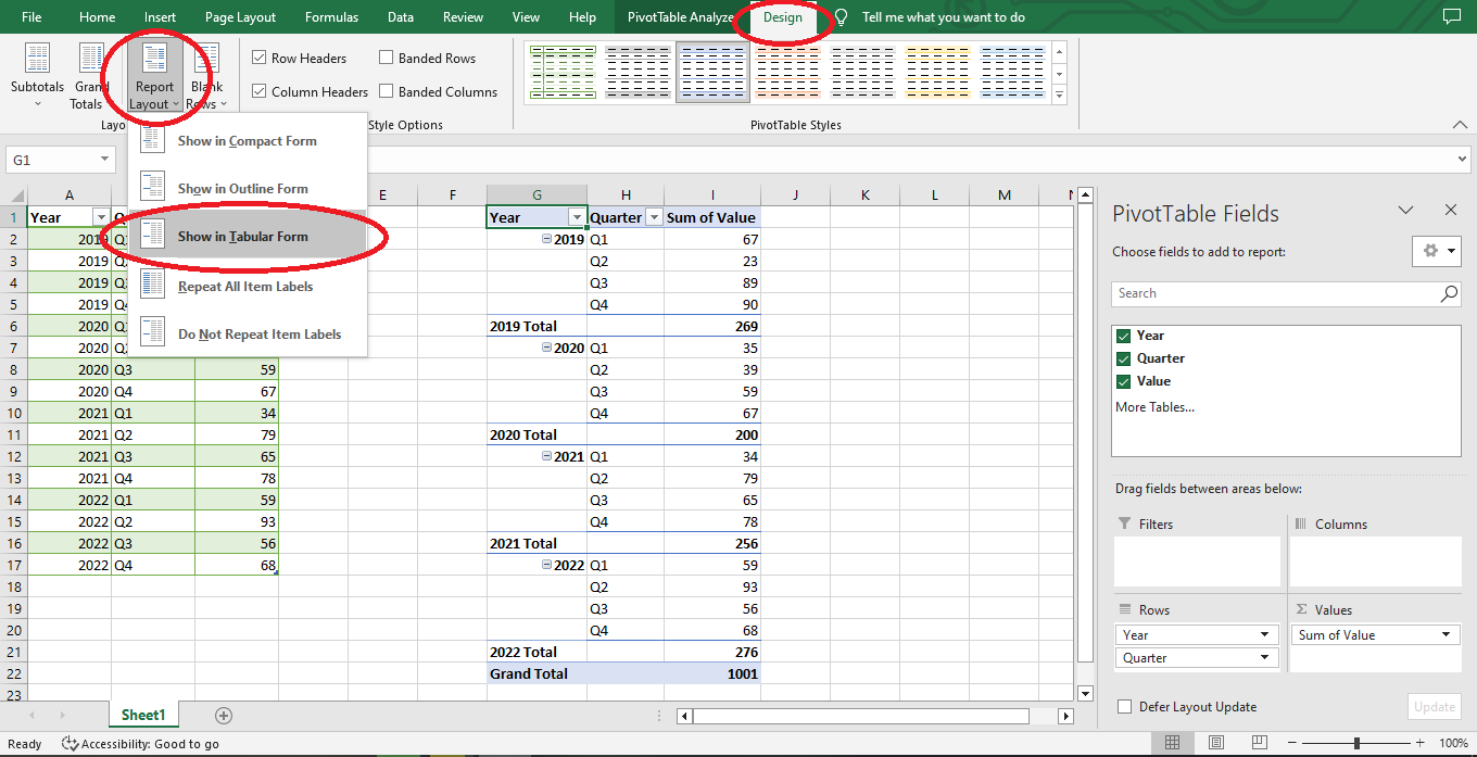
If you want a different view of your data, go to Design, Report Layout, and select Tabular Layout.
-
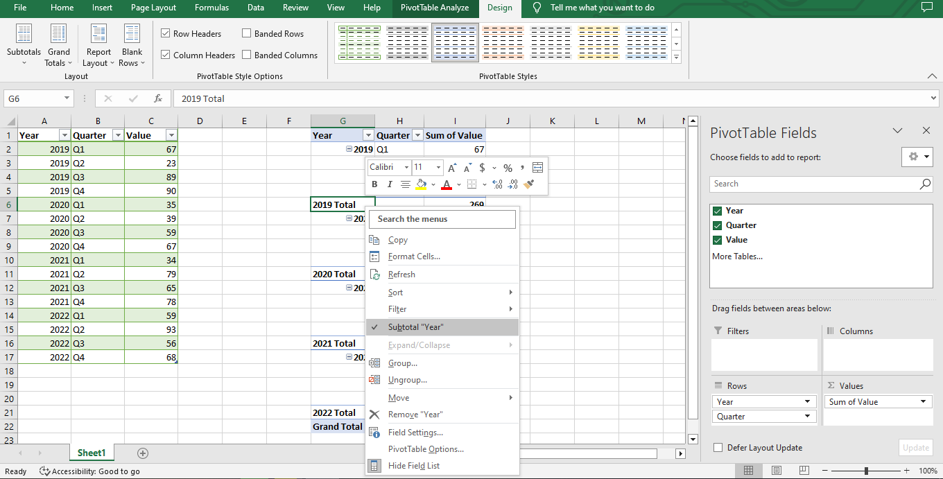
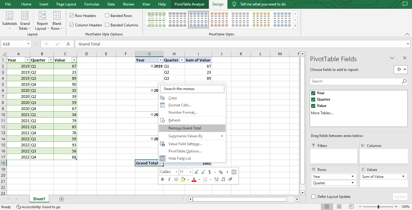
Right-click a cell containing a "Total" word, uncheck the Subtotal "Year," and also remove the "Grand Total" with the same method.
Read Also: Excel Cannot Group Dates in Pivot Table: 3 Quick Fixes to Try
Final Thoughts on Excel Cycle Plot Charts
Excel cycle plot charts help create an accurate picture of trends.
Use it to make your tasks way more manageable and reduce complications
You can visit our home page for more easy-to-follow how-to and step-by-step guides. Check the links in related articles for further details on Google Sheets and Microsoft Excel support!
Read Also: How to Connect Slicers to Multiple Pivot Tables
Frequently Asked Questions on Excel Cycle Plot Charts:
Which type of Excel chart is the best to show progress?
A line chart is the best Excel chart showing how something changes over time. Line charts are helpful when you need to track progress that may be uneven or changing.
What could be causing my Excel data not to plot correctly?
You might need to check that all your cells have the correct number format or that your source data is accurate and up-to-date. But sometimes the problem is more serious, like if parts of the spreadsheet don't match or there are mistakes in any of the formulas you used.
Related Articles:
Want to Make Excel Work for You? Try out 5 Amazing Excel Templates & 5 Unique Lessons
We hate SPAM. We will never sell your information, for any reason.

