
Complete Guide For: Create Win-Loss Sparklines In Excel
Apr 10, 2023
Do you want to create win-loss sparklines in Excel but don't know how?
A win-loss sparkline effectively visualizes data trends and gains/losses over time, making it easier to analyze data trends. The good news is that you can create one using a few simple steps.
In this blog post, we'll show you how to use the Sparklines feature in Microsoft Excel to create informative win-loss charts.
Read on as we discuss the following:
-
What Is a Win Loss Sparkline Chart in Excel?
-
How to Create a Win-Loss Sparkline in Excel
-
Final Thoughts on How to Create Win Loss Sparklines in Excel
-
Frequently Asked Questions on How to Create Win Loss Sparklines In Excel
Read Also: Excel Waterfall Charts: A Comprehensive Guide for Beginners

What Is a Win Loss Sparkline Chart in Excel?
A win-loss sparkline chart is a graph that displays only two outcomes - either positive or negative values. Note that the win-loss sparkline won't indicate the size of the values on the chart.
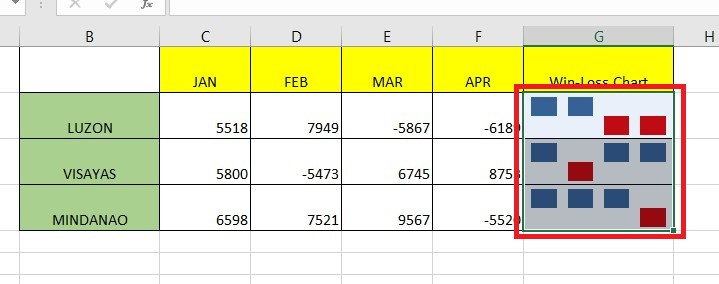
In the Win-Loss chart below, we visualized four data points. It's evident that all, except for the second data point, have a positive value.
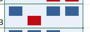
The Win-Loss chart includes values that are zero. When the value is zero or a blank cell, it shows up as a space in the chart. In the example, we can tell that the second value is 0.

How to Create a Win-Loss Sparkline in Excel
Creating a sparkline win-loss chart to visualize positive and negative values is easy.
Follow the steps below to create a sparkline win-loss chart:
-
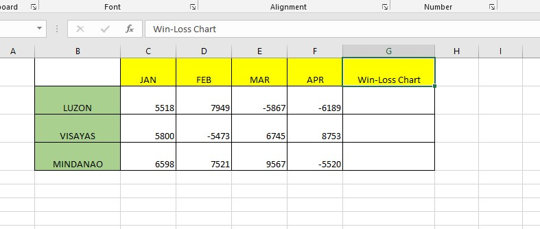
Add a column beside your data. The new column will set the sparkline win-loss charts for each row.
-
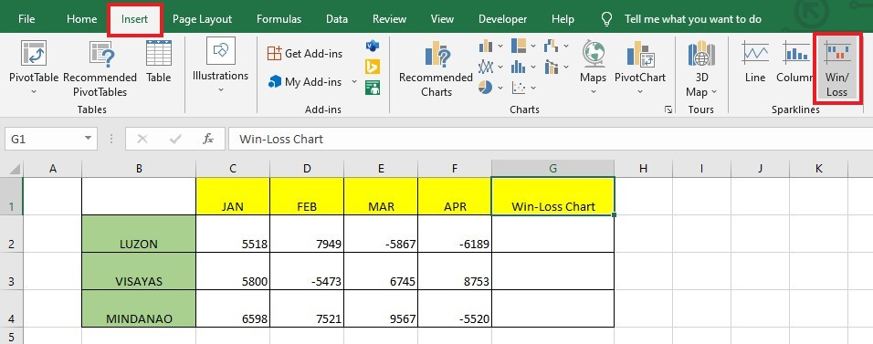
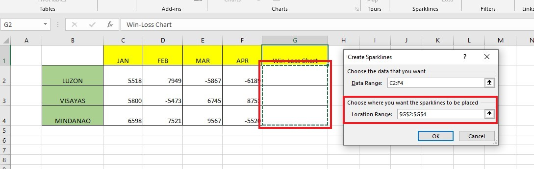
Go to the Insert tab, and click Win-Loss Sparkline in the Sparklines group.
-
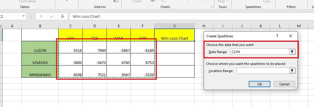
Select the data range you want to visualize inside the Create Sparklines dialog box. In our example, we selected C2:F4, which shows negative and positive values.
-
Select a Location cell range for your Create Sparklines dialog box. Click the OK button.
 Multiple sparklines for each row will appear, indicating the value increase and decrease from the last four months.
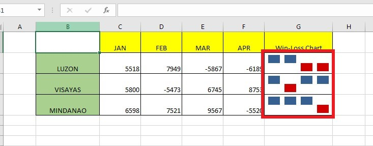
Read Also: How to Insert PivotCharts in Excel: A Complete Guide
The Sparkline Show Group
Under the Sparkline Tools tab, the Sparkline Show Group comprises six show options that can help highlight the essential points in the Sparkline chart. You can also use your preferred color to highlight data points.
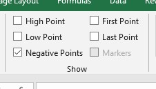
These are the available options you can use for the win-loss sparkline chart under the Show group:
-
High Point- Highlights the maximum value of the win-loss sparkline chart.
-
Low Point- Highlights the minimum value of the win-loss sparkline chart.
-
First Point- Highlights the first data point of the win-loss sparkline chart.
-
Last Point- Highlights the last data point of the win-loss sparkline chart.
-
Negative Points- Highlights the negative data points of the win-loss sparkline chart.
-
Markers- Markers are for the line sparklines. The markers highlight all data points. You can also change the color of the marker in the Marker Color option.
Change the Sparkline's Color and Style
You can change your win-loss sparkline's appearance with the Style and Color option under the Sparkline tab.
You can use the Excel built-in style option. To choose more options, click the drop-down icon of the Style box.
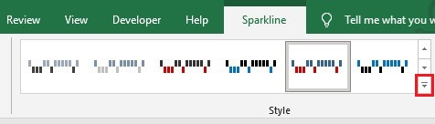
If you want to make a unique Sparkline color, you can use the Sparkline and Marker color options.
Deleting the Sparkline Chart
The Sparkline charts are challenging to delete by hitting the delete key.
To delete Sparkline charts, follow the steps below:
-
Select the cells that have sparkline charts.
-
Click the Clear option.
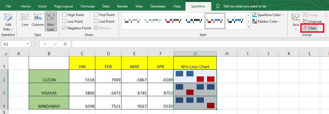 Doing so will delete the selected sparklines in your spreadsheet.
Final Thoughts on How to Create Win Loss Sparklines in Excel
After following these instructions, you should be well-equipped to create win-loss sparklines in Excel. It's a great way to visualize success and breakdowns so that you can take your data to the next level.
For more easy-to-follow Excel guides and the latest Excel Templates, visit Simple Sheets and the Related Articles section of this blog post.
Subscribe to Simple Sheets on Youtube for the most straightforward Excel video tutorials!
Frequently Asked Questions on How to Create Win Loss Sparklines In Excel:
Can I change the Axis for my Sparkline chart, and how?
Yes, you can change Axis to your Sparkline chart with a specific value by following the steps below:
-
Select the cell that has Sparklines.
-
Click the Axis option from the Group.
-
Select the Custom Value from the Vertical Axis Minimum Value Options from the Axis drop-down.
-
In the dialog box, input the value as 0, then click OK.
When should I use a win-loss chart instead of a line or column chart?
It would be best to use a win-loss chart to track data with positive, negative, and neutral values, just like monitoring the wins and losses of basketball teams.
How can I group my sparklines?
If you want to group your sparkline chart, follow the steps below:
-
Select the sparkline charts you want to group.
-
Click the Group Icon under the Sparklines Tools Design tab.
Related Articles:
Excel Spreadsheet Template Comparison: Microsoft vs. Simple Sheets
Microsoft Forms 101 and How To Integrate with Microsoft Excel
Want to Make Excel Work for You? Try out 5 Amazing Excel Templates & 5 Unique Lessons
We hate SPAM. We will never sell your information, for any reason.

