
The Easiest Guide On How To Make A Pie Chart in Excel
May 21, 2023
Do you want to learn how to make a pie chart in Excel for efficient data visualization?
You can create an eye-catching and informative pie chart using Microsoft Office's spreadsheet program with a few simple steps.
Get our free Excel formulas cheat sheet
Plus new tutorials and template drops. Enter your email and we'll send it over.
We'll provide an overview of how to make a practical, organized, and colorful pie chart in Excel. After reading through this brief tutorial, you should be able to produce compelling visualizations that present complex information quickly.
Read on as we cover the following:
-
What Is an Excel Pie Chart
-
How to Make a Pie Chart
-
How to Insert Pie Chart Data Labels
-
How to Create a Personalized Pie Chart in Excel
-
Final Thoughts on How to Make a Pie Chart in Excel
-
Frequently Asked Questions on How to Make a Pie Chart in Excel

What Is an Excel Pie Chart
Microsoft Excel pie charts or circular graphs display the contribution of individual amounts or percentages toward a total. The full pie represents the entire data, while the slices illustrate its portions.
How to Make a Pie Chart
It is quite simple to create a pie chart using Excel, requiring only a few clicks of a button. The essential step is to organize the source data correctly in your worksheet and select the appropriate pie chart type.
-
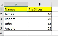
Prepare the pie chart data.
-
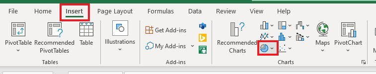
Click the Insert tab on your Excel ribbon, move your mouse to the Charts group, and select the "Insert Pie or Doughnut chart."
-
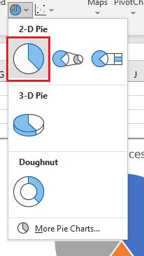
Choose the pie chart icon in the "Insert Pie or Doughnut chart" menu under 2-D Pie.
-
Choose a pie chart style under the Chart Styles Group.
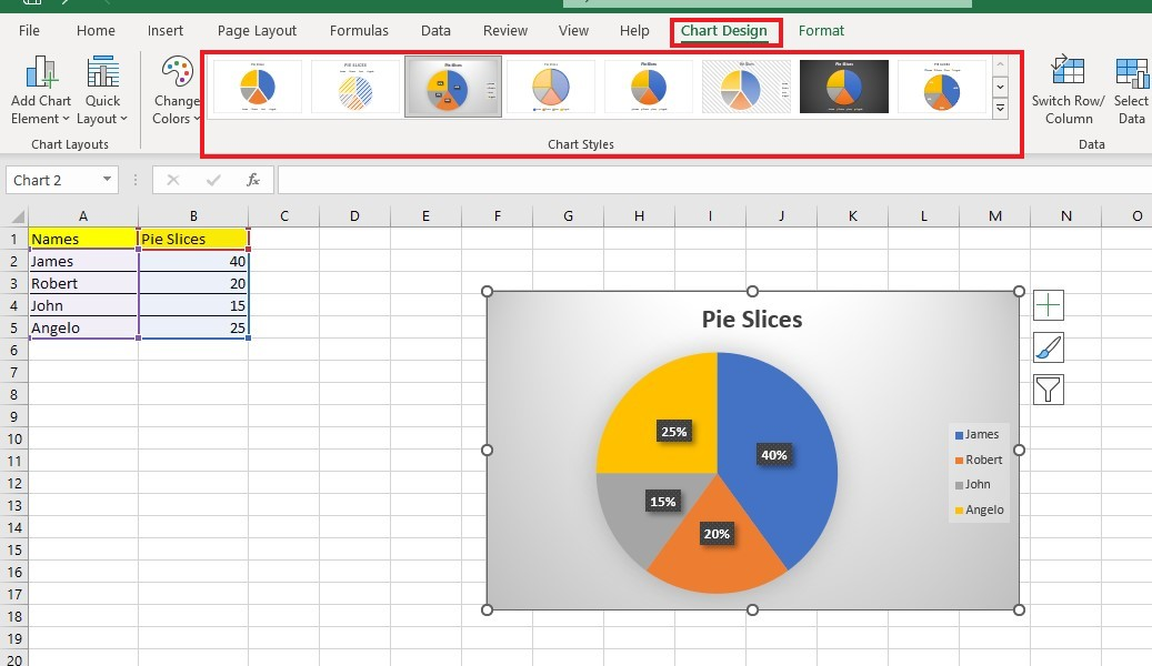
You can customize the pie graph, including its chart title, colors, and data labels.
Insert Pie Chart Data Labels
It is essential to include labels to communicate data through pie charts in Excel effectively. After all, data labels help easily interpret the pie chart in Excel.
If you insert a pie chart, Excel includes a legend by default. Additionally, if you type and select the category names while creating the chart, they will automatically appear on the visualization.
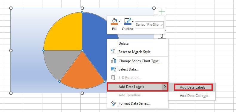
Display numerical values in a pie chart.
You can follow these steps to show numerical values on the pie chart: right-click on the chart and select the 'add data labels' option.
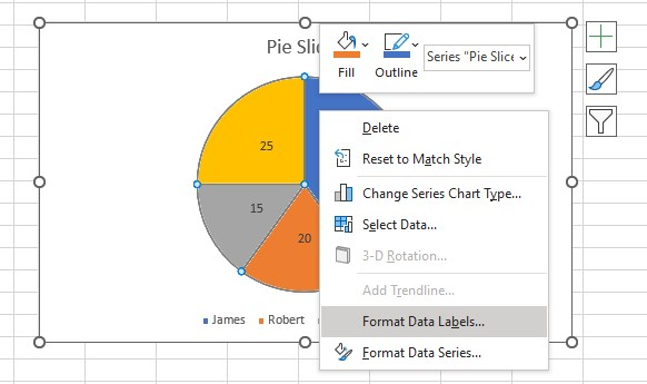
Format pie chart data labels.
To format data labels or the pie chart slices, follow these steps:
-
Right-click the chart, and click "format data labels."
-
Choose your desired options in the Format Data Labels pane.
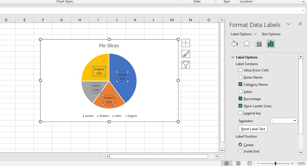
The Format Data Labels pane includes the percentage value, category name, and more. Moreover, you can change the data series in the Format Data Series pane and adjust the font size and color.
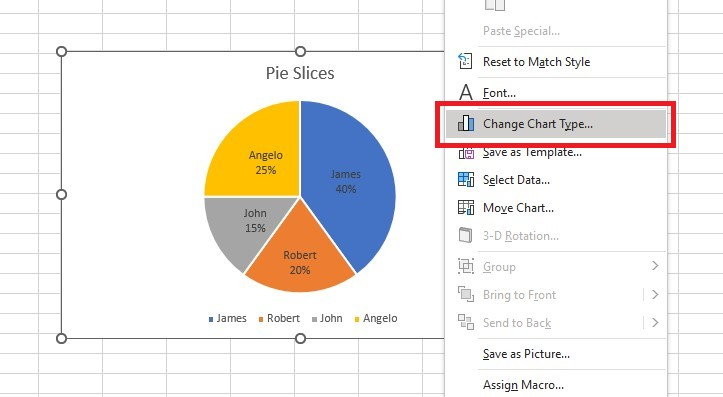
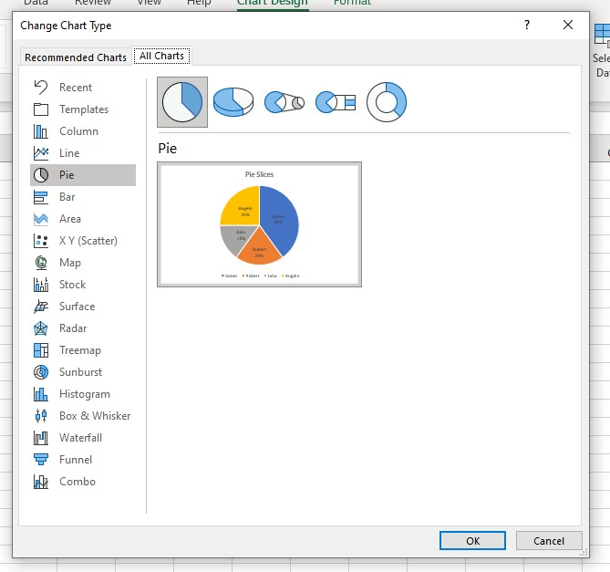
Change chart type of the pie chart.
To make a different type of chart or visualization for your data, like a bar chart or a doughnut chart, you can modify the chart type by following these steps:
-
Right-click the pie chart.
-
Select "Change Chart Type."
How to Create a Personalized Pie Chart in Excel
After learning how to create a pie chart in Excel, you must know how to modify and personalize it.
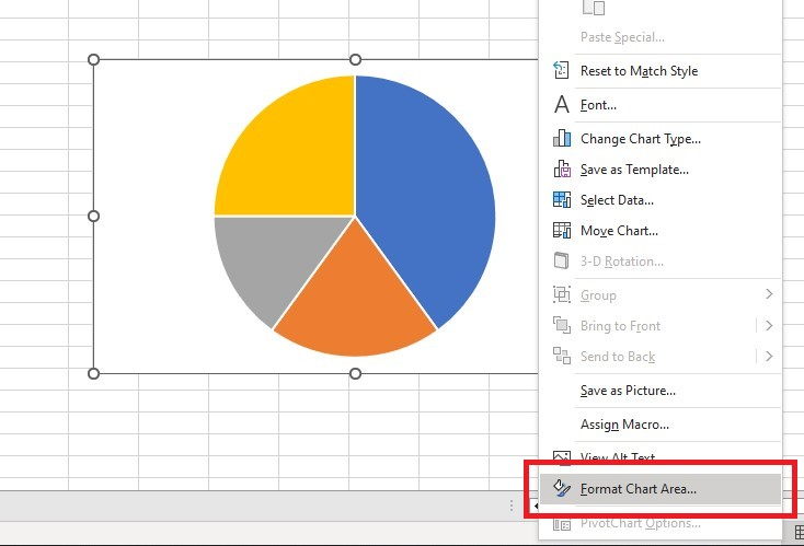
Edit the pie chart background color.
Here are the steps to changing your pie chart's background color:
-
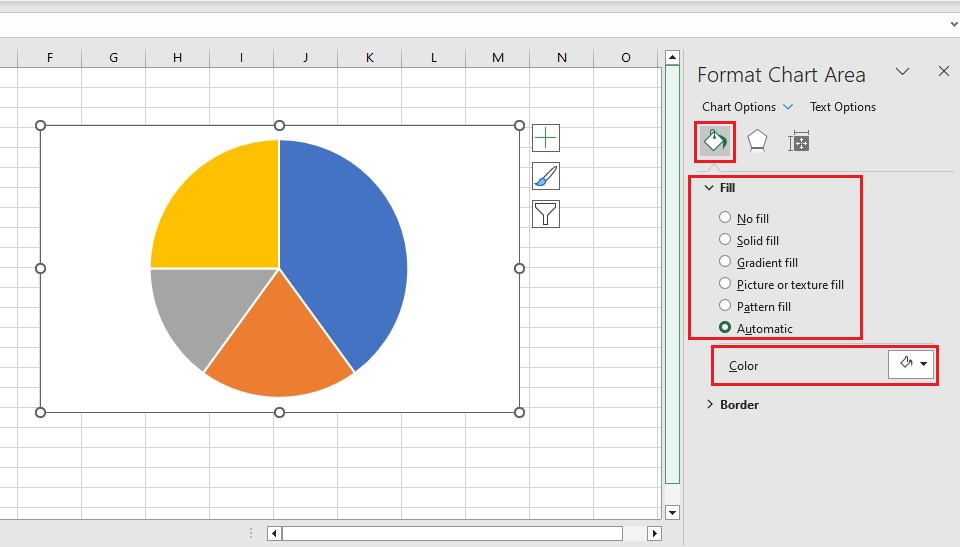
Right-click your pie chart and go to the Format Chart Area pane.
-
Click the Fill and Line tab to choose an Excel default background fill or a color.
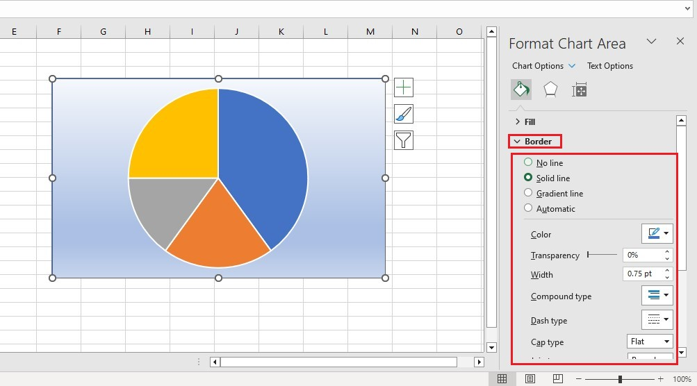
Customize the pie chart border.
To edit the border of your pie chart, go to the Format Chart Area pane. You can adjust the border transparency, width, color, and other settings.
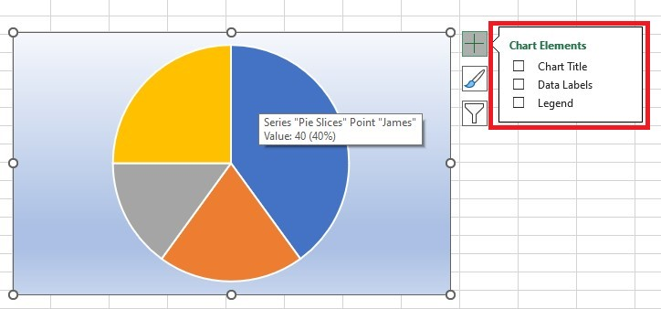
Add pie chart elements.
To add chart elements like chart titles, data labels, and legends to your pie chart, follow the steps below:
-
Click the green crossed button at the right side border of your pie chart.
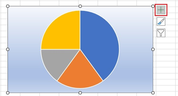
-
Select the chart elements you want to add.
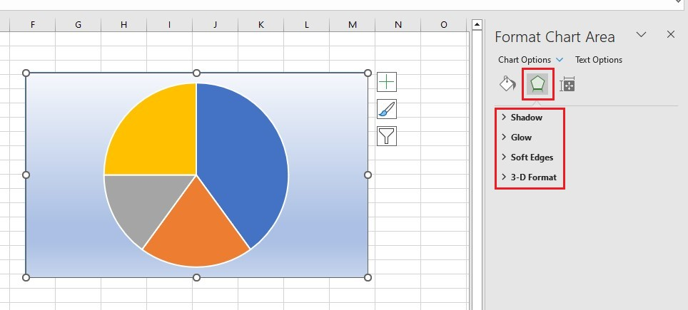
Add pie chart effects.
To customize the appearance of the pie chart box, like its shadow, soft edges, and glow, click on the pentagon shape in the Format Chart Area pane.
A personalized chart can make your presentation visually appealing rather than sticking to the default pie chart.
Final Thoughts on How to Make a Pie Chart in Excel
Our guide should help you thoroughly understand how to make a pie chart in Excel.
You create simple and visually appealing pie charts to summarize data. Moreover, with the right settings adjustments, you can customize the chart and make it look more complex.
For more Excel easy-to-follow guides and the latest Excel templates, visit Simple Sheets now! and the Related Articles section of this blog post.
Don't forget to Subscribe to Simple Sheets on YouTube for more easy-to-follow Excel video tutorials!
Frequently Asked Questions on How to Make a Pie Chart in Excel
How can I explode a part of my pie chart?
To highlight a particular pie chart slice, you can move it away from the rest of the chart. Double-click on the slice and drag it to where you want it.
Can I change the location of my data labels in my pie chart?
To relocate data labels in Excel, access the 'Add Chart Element' option from the toolbar, select 'Data Label,' and choose the preferred location.
What chart should I choose between a pie or a bar chart?
If you have a data set with fewer than six categories and you want to display the percentage of the whole, a pie chart is recommended. Conversely, bar charts are more suitable for comparing categories in a large data set.
Related Articles:
How to Overlay Graphs in Excel
The Sunburst Chart In Excel: Everything You Need to Know
Excel Spreadsheet Template Comparison: Microsoft vs. Simple Sheets
Want to Make Excel Work for You? Try out 5 Amazing Excel Templates & 5 Unique Lessons
We hate SPAM. We will never sell your information, for any reason.

