
Beginners Guide: How To Make A Scatter Plot In Google Sheets
Mar 22, 2023
Are you searching for a fast and easy way to create data visualizations? Do you want an efficient way to communicate your data?
Well, a scatter plot chart can help you illustrate data trends. This user-friendly feature allows you to compare different data sets. Google Sheets makes the process even easier!
This blog post will teach you to create a scatter plot in Google Sheets and get more out of our charts.
Read on as we cover the following:
-
What Is Google Sheets Scatter Plot?
-
Create a Scatter Plot in Google Sheets.
-
Customize Scatter Charts.
-
Final Thoughts on How to Make a Scatter Plot in Google Sheets.
-
Frequently Asked Questions: How to Make a Scatter Plot in Google Sheets.
Read Also: Simple Google Sheets Sum of Column Guide
What Is Google Sheets Scatter Plot?
Scatter Plot, also known as a bubble Chart, XY Graph, or Scatter chart, is a chart feature in Google Sheets. You can use them to visualize data points by plotting the dots on a horizontal and vertical axis.
Create a Scatter Plot in Google Sheets.
-
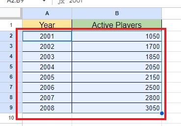
Select your sample data range.
-
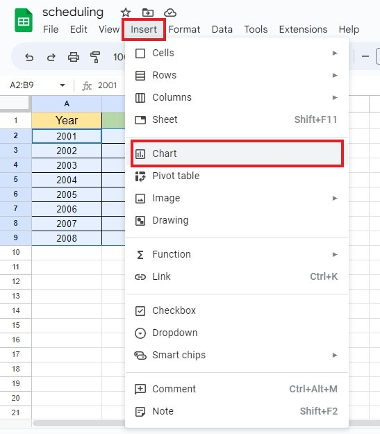
Go to the Insert tab and choose the Chart option.
-
Once the Chart Editor sidebar appears, click the Chart Type drop-down menu and select Scatter Chart. You can also click the Aggregate box to present the data point.
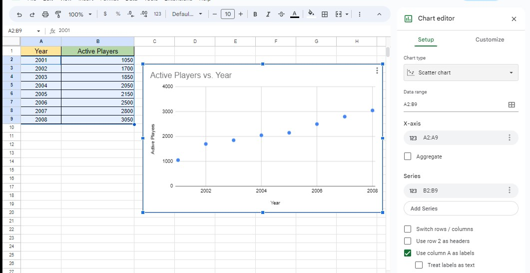
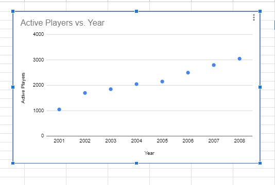
You now have your Scatter Plot Graph/Chart in Google Sheets.
Read Also: How to Change Currency in Google Sheets
Customize a Scatter Chart.
Add Error Bars, a Trend Line, and Data Labels
-
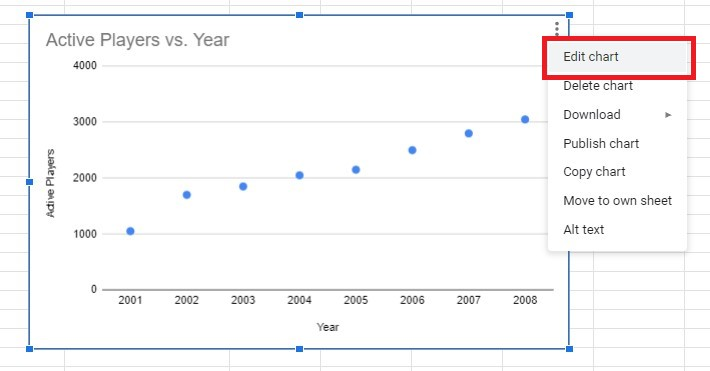
In the Scatter chart's Menu, click the Edit Chart option.
-
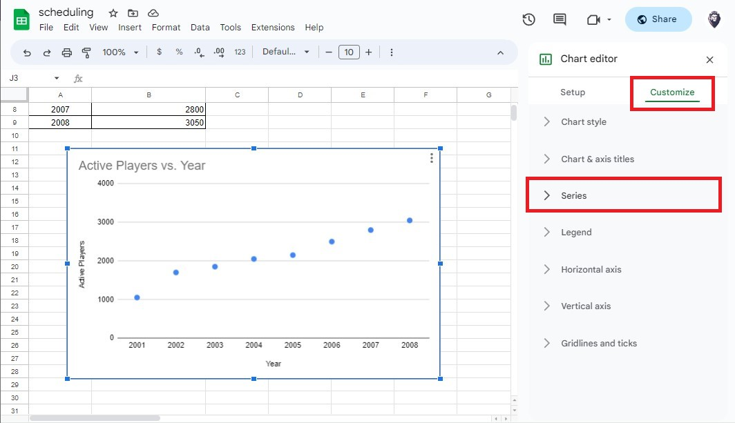
Go to the Customize tab in the Chart Editor sidebar menu and click the Series or Data Series option.
-
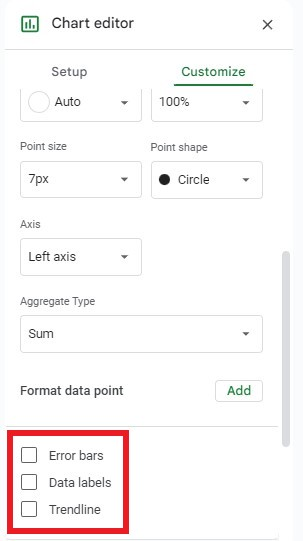
Scroll down in the Data Series option, and select Error bars, Data labels, and Trendline.
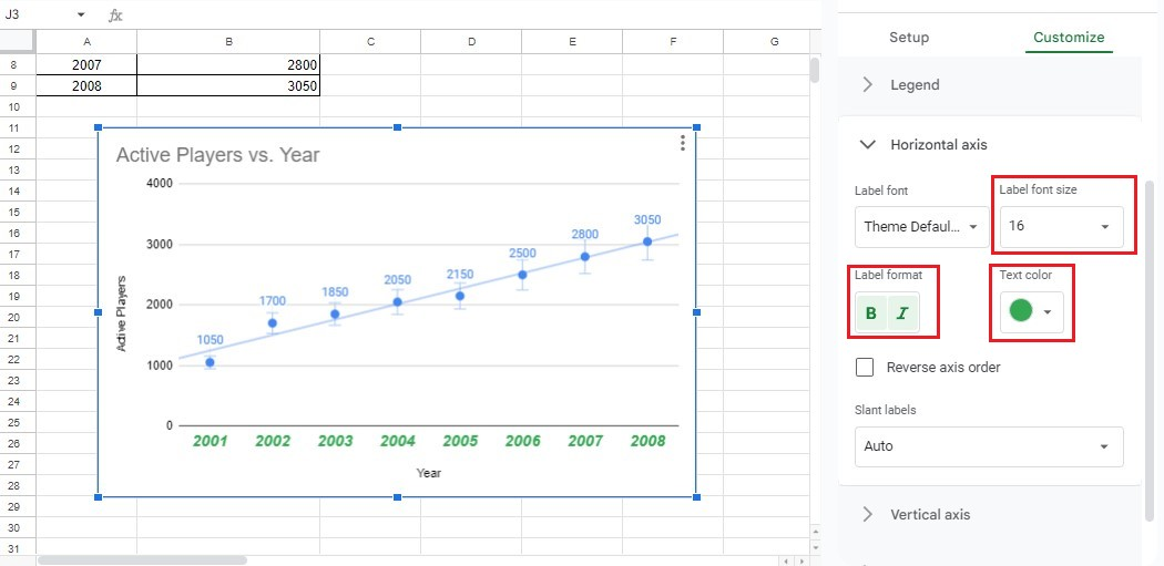
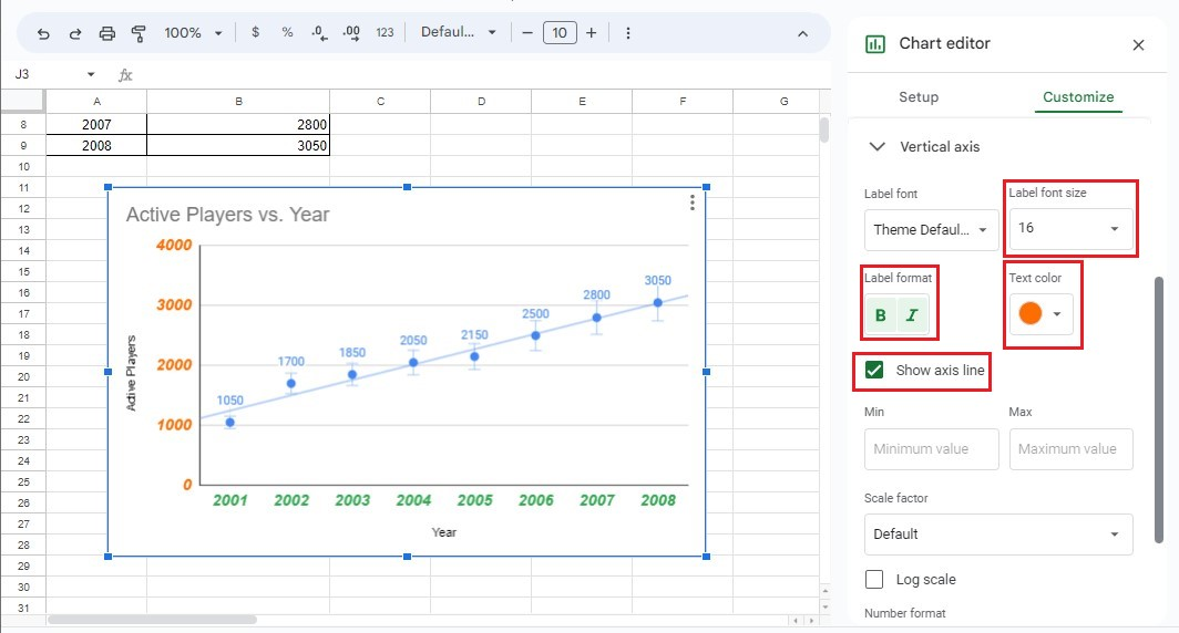
Customize the Horizontal and Vertical Axis.
-
Customize the Horizontal Axis, X-values, or X-Axis. You can also change the label font size, format, and text color.
-
Customize the Vertical Axis, Y-values, and Y-Axis. You can show the axis line and change the label font size, format, and text color.
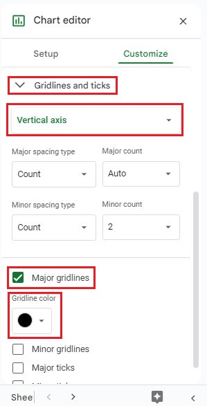
Customize the Gridlines.
-
Go to Gridlines and Ticks under the Customize tab. Select Vertical Axis, click Merge gridlines, and select a gridline color.
-
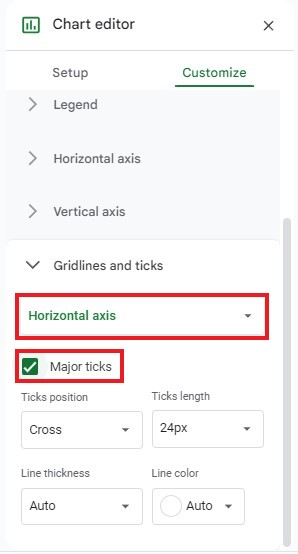
Under the Customize tab, click Gridlines and Ticks. Select Horizontal Axis, and click Major Ticks.
Read Also: How to Create a Sunburst Chart in Excel? Complete Guide
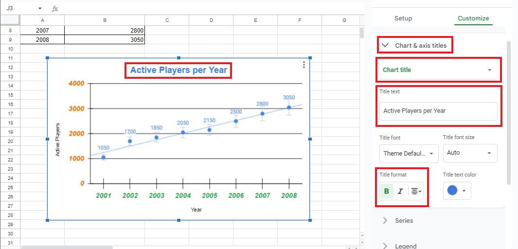
Customize the Chart and Axis Titles
-
In the Customize tab, go to Chart & Axis Titles. Click Chart Title, rename the chart title, and change the title format.
-
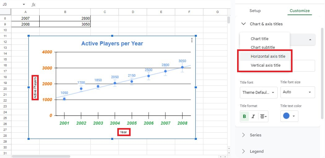
To customize the Horizontal and Vertical Axis Title, follow the same procedure in Step 1.
You now have a customized Scatter Plot Chart in Google Sheets using the simple steps above!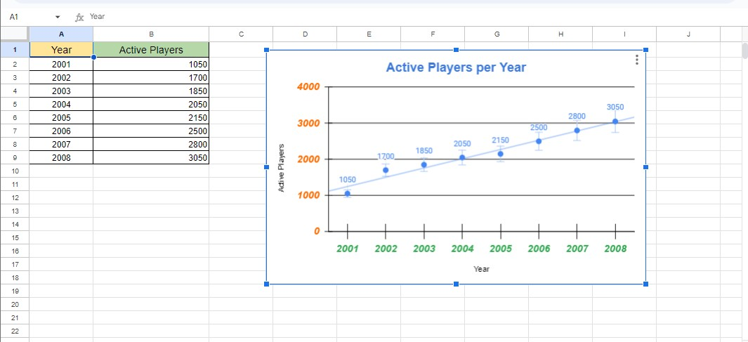
Final Thoughts on How to Make a Scatter Plot in Google Sheets.
Learning how to make a scatter plot in Google Sheets can provide invaluable insights into data analysis. It is an easy-to-use feature that does not require much technical knowledge. Moreover, it provides a practical way to illustrate your data.
For more easy-to-follow Google Sheets guides and the latest Google Sheets Templates, visit Simple Sheets. Subscribe to Simple Sheets on Youtube for the most straightforward Google Sheets video tutorials!
Frequently Asked Questions: How to Make a Scatter Plot in Google Sheets:
How can I remove gridlines from my Scatter chart in Google Sheets?
To get rid of gridlines, do the following:
-
Open the Chart Editor Pane, then select the Customize tab.
-
Inside that tab, open the Gridlines and Ticks submenu.
-
Deselect both the Major and Minor Gridlines checkboxes.
How can I make a scatter plot with multiple data sets?
-
Select multiple data sets.
-
Insert a scatter chart for those multiple data sets.
-
Customize the scatter chart settings to add context.
-
Add the Trendline, chart equation, and data analysis method.
What kind of data should I use for Scatter Plots?
You can use a Scatter Plot chart when you have two columns of data or variables. Plotting them is the easiest way to determine and show their data relationship and correlation.
Want to Make Excel Work for You? Try out 5 Amazing Excel Templates & 5 Unique Lessons
We hate SPAM. We will never sell your information, for any reason.

