
Overlay Graphs In Google Sheets : Everything You Need To Know
Jun 11, 2023
Do you want your data to come alive in Google Sheets?
Overlaying graphs can be an excellent way to compare two or more data sets. Moreover, the design makes it easier for users to recognize patterns and trends.
After all, visual representations help users quickly identify similarities, differences, spikes, dips, or changes between datasets.
With a few clicks, overlay graphs in Google Sheets can help even those with limited technical knowledge turn dull spreadsheet cells into colorful, informative visuals.
Read on as we cover the following:
-
Overlay Graphs in Google Sheets
-
Combo Chart In Google Sheets
-
Stacked Column Chart in Google Sheets
-
Final Thoughts on Overlay Graphs in Google Sheets
-
Frequently Asked Questions Overlay Graphs in Google Sheets
Overlay Graphs in Google Sheets
One way to create impactful visual data presentations is by using overlay graphs.
These graphs allow you to showcase multiple data sets on a chart without confusion.
And the best part? Creating these charts is easier than you might think, even if you're not an Excel master.
Combo Chart in Google Sheets
A combo chart is an overlaying chart type with multiple data points using different charts.
Moreover, you can use it to visually appeal and meaningfully show data.
A common example of a combo chart is a bar chart style combined with a line chart to create a data presentation.
The line graph in the combo chart represents the highs and lows, while the column chart represents the values.
Steps to make a combo chart
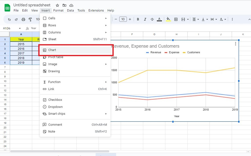
Here are the steps to create a combo chart in Google Sheets:
-
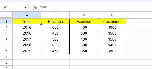
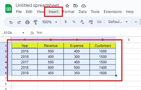
Prepare your data range.
-
Choose the data range and click the Insert menu.
-
Click the Chart option, and Google Sheets will recommend an ideal chart for your data range.
-
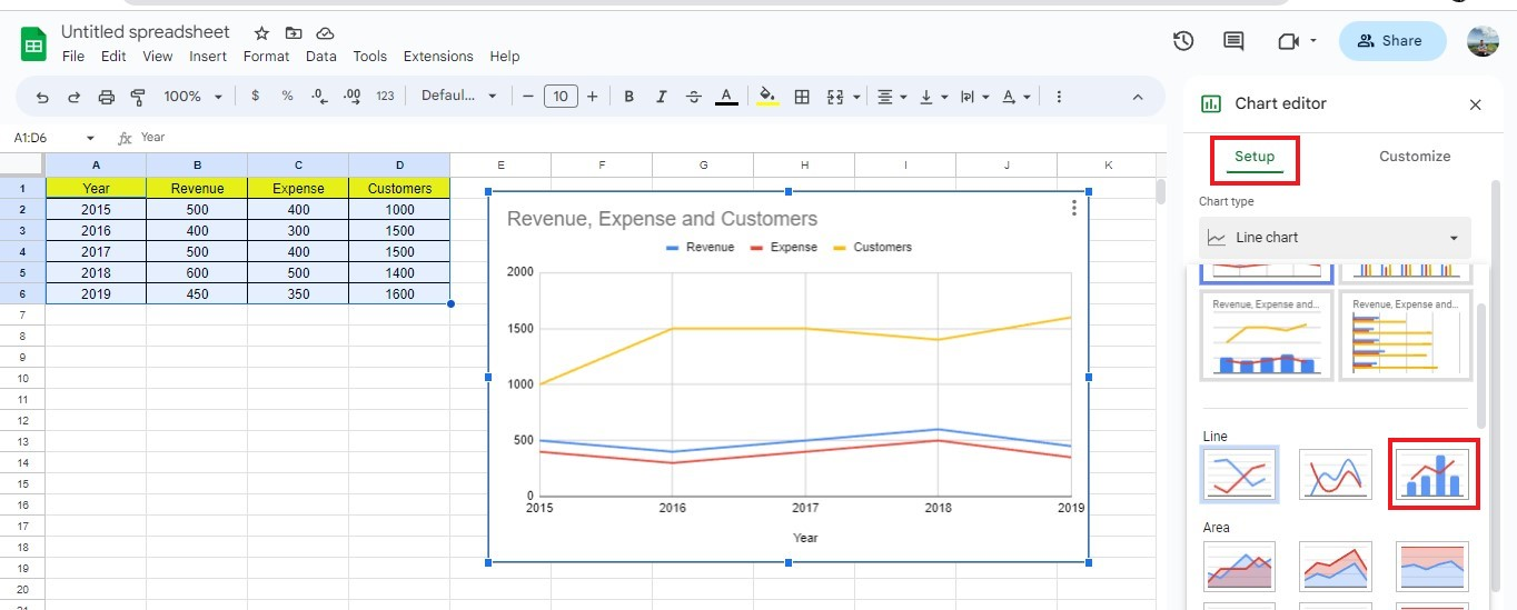
Under the Chart Editor, click the Setup tab, and click Combo chart from the Line graphs group.
-
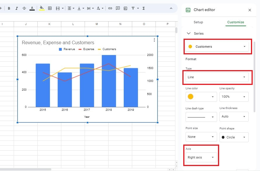
For a better visual representation of the chart data, click the Customize tab and select the Data Series section.
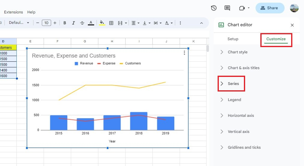
You may now customize your combo chart according to your preferences.
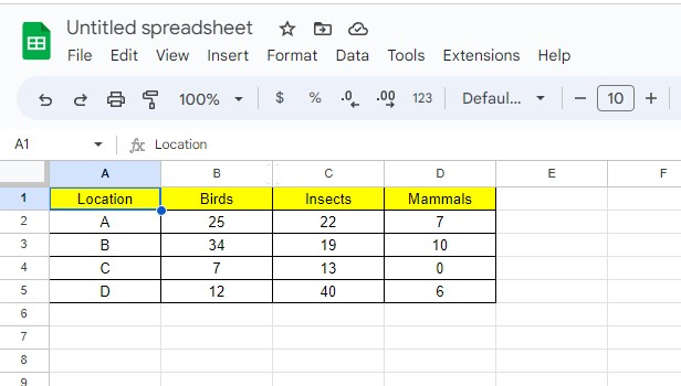
Stacked Column Chart in Google Sheets
A stacked column chart is a presentation that splits data into different parts.
Moreover, this built-in chart is easy to read and understand.
How to make a stacked column chart
To make a stacked column chart, follow the steps below:
-
Prepare your data set.
-
Click the insert menu and click the chart option.
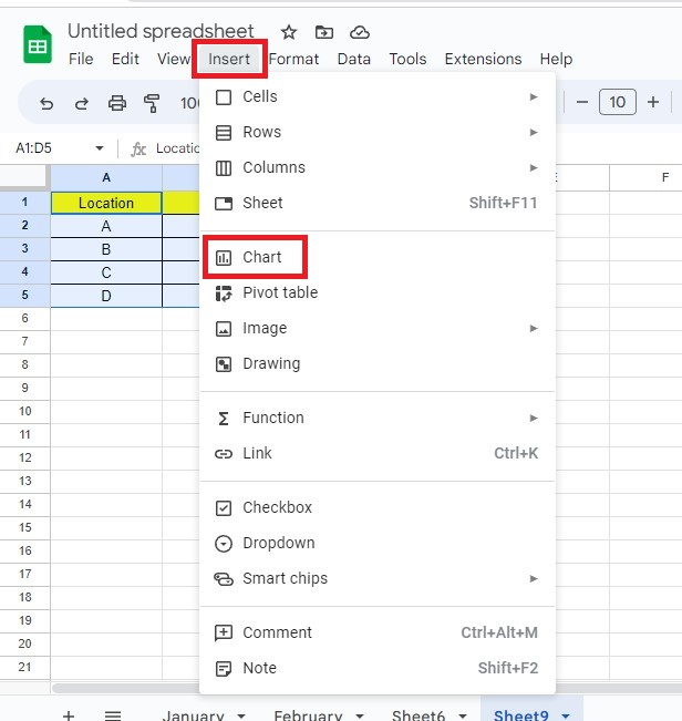
-
In the chart editor, go to Setup and click the stacked column chart.
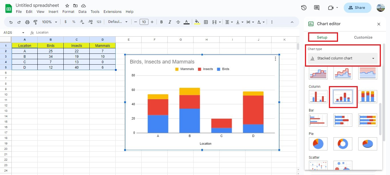
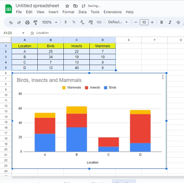
You now have successfully created a stacked column chart in Google Sheets.
Final Thoughts on Overlay Graphs in Google Sheets
After exploring this topic, it's clear that implementing and using overlay graphs in Google Sheets is incredibly beneficial.
It can help with data visualization, making complex problems easier to understand and helping give insights into the structure of the datasets.
Visit Simple Sheets for more easy-to-follow guides, and remember to read the related articles section of this blog post.
Subscribe to Simple Sheets on Youtube for the most straightforward Google Sheets video tutorials!
Frequently Asked Questions Overlay Graphs In Google Sheets
Where can I customize the x-axis and y-axis of my chart?
Follow the steps to customize the x and y axis of your chart:
-
Go to the Chart Editor.
-
Select the Customize tab.
-
You can select the Horizontal Axis to customize your x-axis or Vertical Axis to customize your y-axis.
Which type of stacked chart should I use, a column or a bar chart?
The decision relies on the type of data you are trying to use and the format that suits your needs:
-
A stacked column chart is useful for comparing the total size of different categories.
-
A stacked bar chart can be better for displaying the proportions of each category.
How can I add another series to Google Sheets chart?
To add series sets, follow the steps below:
-
Open the spreadsheet from Google Sheets.
-
Double-click on the chart that needs changing.
-
Click on Configure.
-
Click the Add Axis Series links below.
-
Choose your X-axes and Series.
Related Articles:
The Simple Guide: How To Create A Scorecard In Google Sheets
Beginners Guide: How To Make A Scatter Plot In Google Sheets
Want to Make Excel Work for You? Try out 5 Amazing Excel Templates & 5 Unique Lessons
We hate SPAM. We will never sell your information, for any reason.

