
The Easiest Guide You Must Have: Excel Histogram
May 11, 2023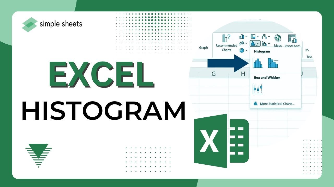
Do you want to know how an Excel histogram can take your data analysis to the next level?
This nifty tool lets you quickly visualize dataset distribution for easier analysis.
Creating a histogram easy with Excel. Moreover, it provides simplified insights into your data.
Read on as we cover the following:
-
What Is an Excel Histogram?
-
Create a Histogram with the Data Analysis Toolpak
-
Create a Histogram from the Insert tab
-
Create a Histogram with the FREQUENCY Function
-
Format the Histogram Chart
-
Final Thoughts on the Excel Histogram
-
Frequently Asked Questions about the Excel Histogram
What Is an Excel Histogram?
A histogram is a column chart showing elements' frequency in a particular range. It displays the number of elements in each consecutive interval, or bin, without overlap.
We will explore three methods for creating histograms in Excel.
Quick Tip: Check out Simple Sheets' guide on how to insert column charts in Excel!
Create a Histogram with the Data Analysis Toolpak
To begin using this method, you must load the Data Analysis Add-in.
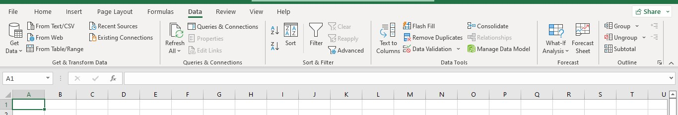
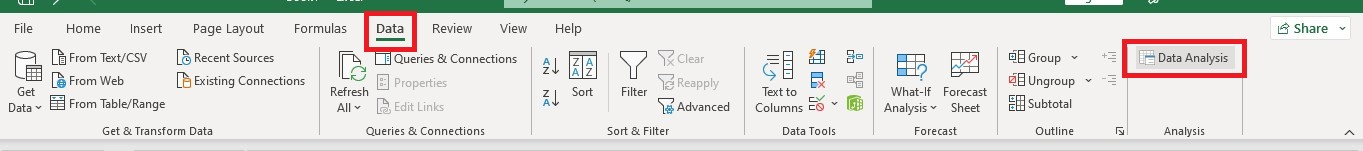
To find the Data Analysis command group, go to the ribbon and click the Data tab. You must load the add-in if you do not see the Data Analysis icon.
Activate the Data Analysis Tool.
-
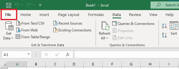
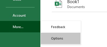
Go to the File tab.
-
Click More and Options.
-
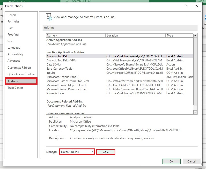
Click Add-ins in the Excel Options, then go to the Manage drop-down box. Choose Excel Add-ins and click the Go button.
-
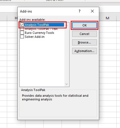
In the Add-ins dialog box, select Analysis Toolpak, and click the OK button.
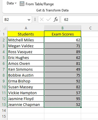
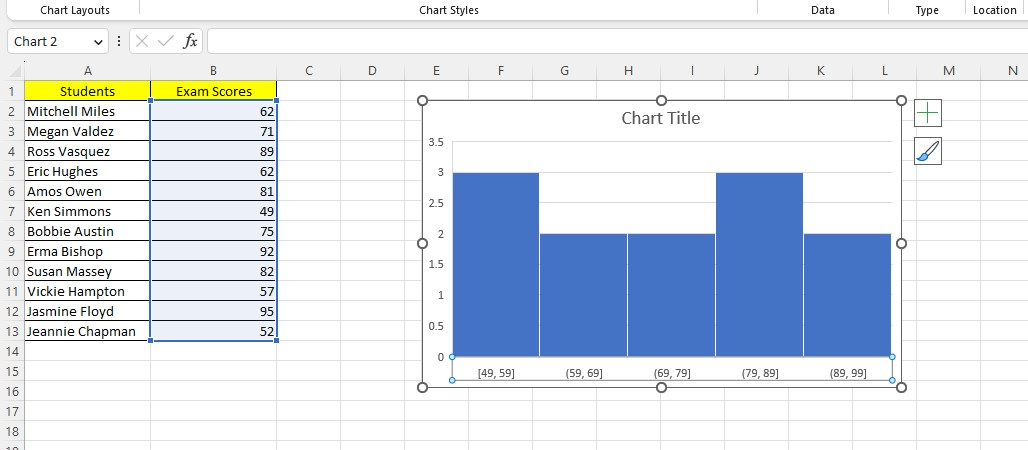
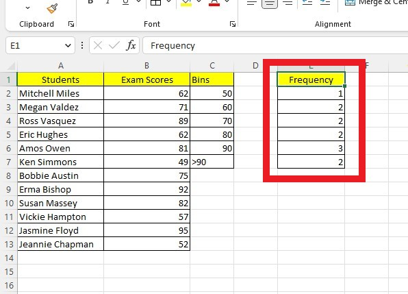
In our example below, we will create a histogram using exam scores.
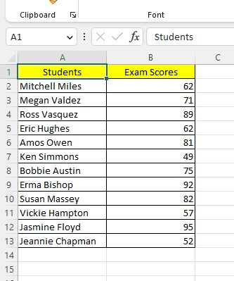
We will use the cells in the B2 to B13 as the source data.
The next important step is to create bins.
What Are Histogram Bins?
Bins are numerical categories that classify input data into consecutive, similarly sized, and non-overlapping intervals.
Creating bins in a separate column to group your data would be best. Column E is where you should list the bins.
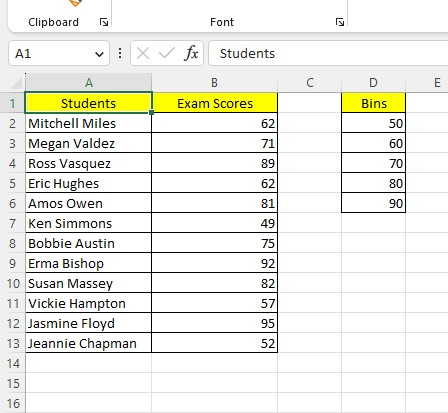
The bins begin with a first value of 50 and the set in intervals of 10, which is a common practice for consistency. It's important to show the bins in ascending order and ensure no value overlap.
Our last specified bin in Excel is 90; you will place any values greater than that into a new bin. After completing all the necessary preparation, you can use Excel to generate a histogram.
-
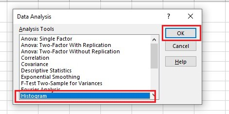
Go to the Data tab, and click Data Analysis.
-
In the Data Analysis box, select Histogram and click the OK button.
-
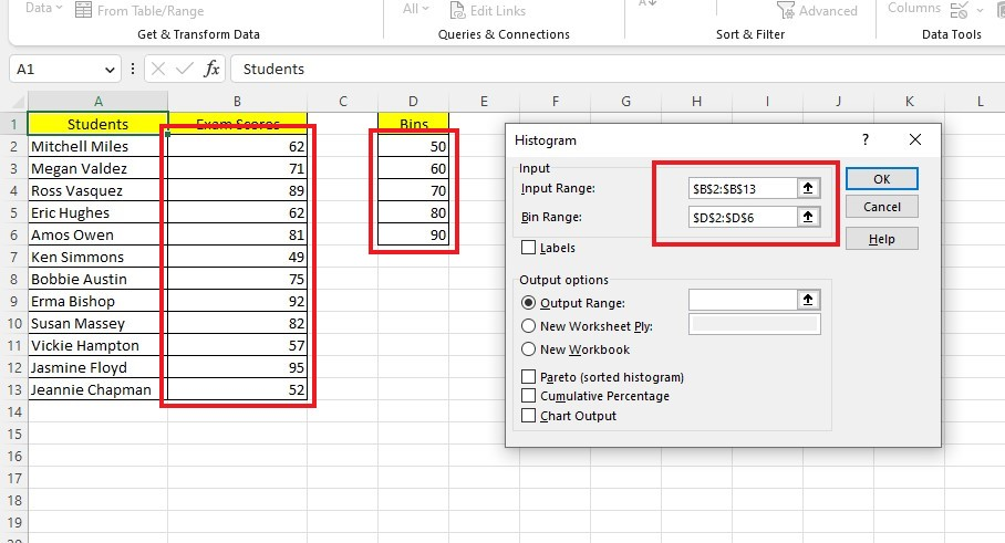
Select an Input range and Bin range.
-
Select an Output Range, where you will put your histogram.
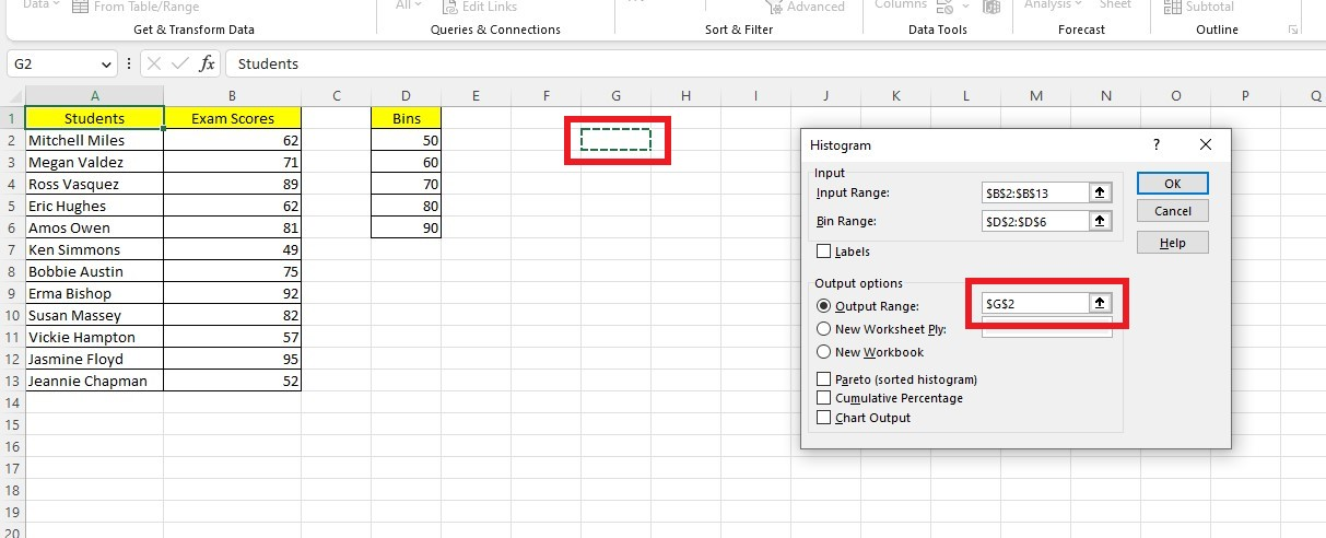
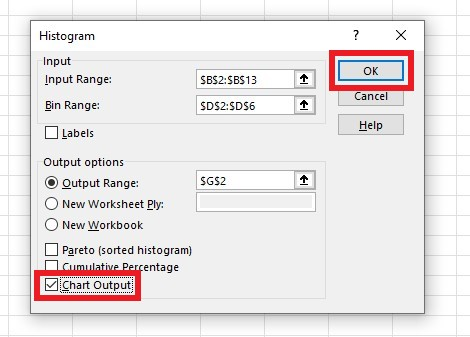
-
Check the Chart Output option to create an embedded histogram chart and click OK.
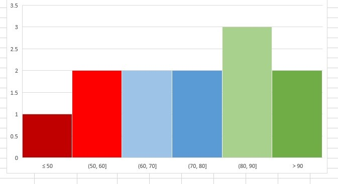
Excel will insert a graphical representation of a histogram chart based on the data points in the table for each range in our data set. As you can see, the data points are similar to the Bar chart.
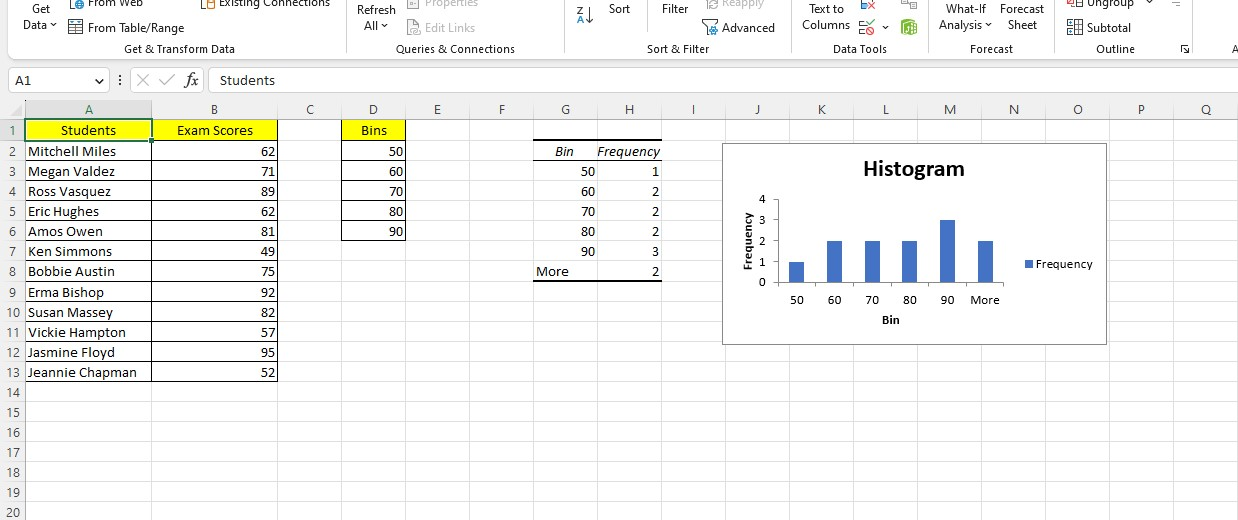
Excel creates a histogram graph within the current worksheet, including these elements:
-
A frequency distribution table in cells G1 to H7
-
Bins on the horizontal axis
-
A vertical axis that includes the frequency of grouped values
-
A series labeled "More" for values exceeding the last bin
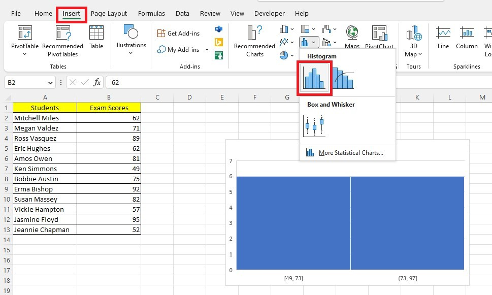
Create a Histogram from the Insert tab
Excel 2016 and newer versions let you create a histogram without using the Data Analysis Add-in. Just insert a histogram like you would insert any chart.
The built-in tool updates the chart immediately when there are changes in the dataset. To use it, follow these steps:
-
Select your cell data range.
-
Go to the Insert tab, click the Insert Static Chart drop-down menu, then select a histogram chart.
The normal reference rule is most effective when applied to normally distributed data. It reduces the bias in the histogram compared to the original dataset.
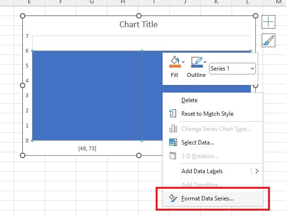
Before your chart can be useful for data analysis or interpretation, you must customize the chart bins.
-
Right-click your chart and click the Format Data Series pane.
-
Click the Series Options, and select Horizontal Axis.
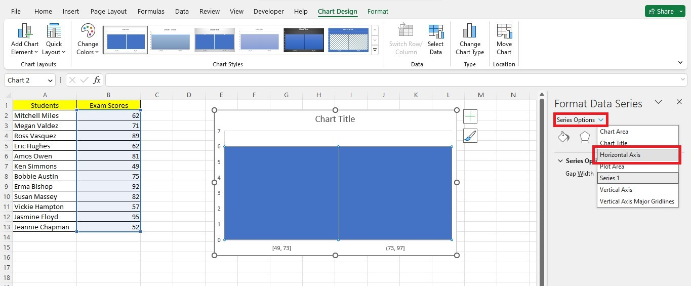
-
You can modify bin properties by accessing the Format Axis pane, such as the number of bins, bin width, underflow bin, and overflow bin.
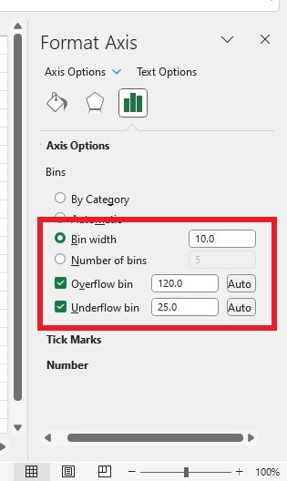
The histogram chart will change its appearance after applying the changes.
Create a Histogram with the FREQUENCY Function
You can create an Excel Histogram using the dynamic FREQUENCY function.
Here's the FREQUENCY function syntax:
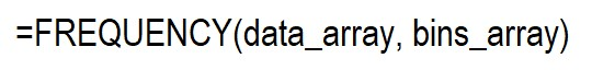
To use the FREQUENCY function, you need two arguments:
-
Data_array: This is the dataset you want to analyze.
-
Bins_array: This array or range will group your data into frequency counts.
The function returns a list showing the number of data points sinking into each bin.
The FREQUENCY function is also known as an array function. Before Excel 365, you need to select the cells where you want the resulting list to appear and enter the formula using the specified syntax.
To enter an array formula, press the keys CTRL+SHIFT+ENTER instead of Enter. This is also why the formula is sometimes called the CSE formula. Excel will add curly brackets around the formula to indicate an array formula.
To use the FREQUENCY function as an array function in Excel, you need to have a current version of Microsoft 365. Type the formula in the first cell of your desired output range and press ENTER as usual.
Guide to Making a Histogram with the FREQUENCY Function
-
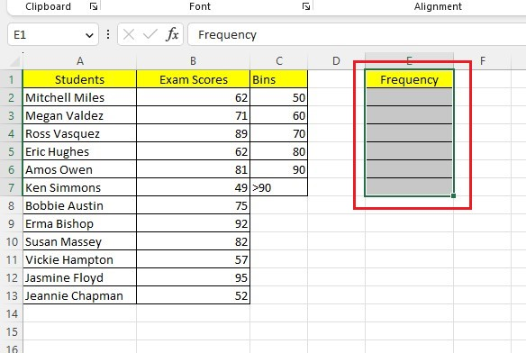
Create a helper column.
-
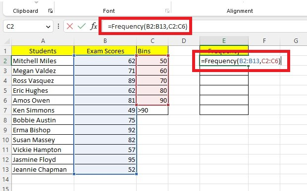
Select an Output range and type the FREQUENCY formula.
-
Press the Enter Key to get the results.
The length of the returned array is greater by one compared to the length of bins_array, which you can observe.
The additional element in the returned array will tell you the count of any values above the highest interval, comparable to the 'More' bin in the Data Analysis method and the 'Overflow Bin' in the Insert Chart method. Its recommended to label the corresponding cell (C7) appropriately.
Format the Histogram Chart
We have reached the stage where Excel has generated a graph showing the distribution of the exam scores. However, it will require a few minutes to format the chart for a better presentation. Here are some ways you can customize the histogram chart:
Insert chart elements
To modify your chart's title, axis titles, data labels, gridlines, and legend, select your chart and click on the green plus (+) symbol at the top right-hand corner to display a menu of checkbox options. Furthermore, you can access more specific details by clicking the black triangle to the right of each option.
To add chart elements, follow these steps: select the chart and click on the Design tab in the ribbon. From there, choose the Quick Layouts option, which provides pre-made combinations specific to your chart type.
Change the size of the histogram chart.
To resize the chart, click on it and drag any of the eight handlebars. The four corner handles will resize the chart proportionally, while the middle right and left handles will only change the width without affecting the height.
The middle, top, and bottom handles only adjust the graph's height without affecting its width.
Customize the axis
To customize the axis elements, right-click on the desired axis. A panel with different options will appear on the right side of your screen, where you can modify the settings as required.
Delete the gaps between bins.
To set Gap Width as zero, follow these steps:
- Select the columns and right-click them.
- Choose Format Data Series.
- Navigate to the Format Data Series pane and make the necessary changes.
Final Thoughts on the Excel Histogram
An Excel histogram is a powerful tool that lets you quickly visualize your data to uncover valuable insights. This feature allows us to see patterns or outliers in the data, helping us understand complex data distributions.
Visit Simple Sheets for more easy-to-follow guides, and remember to visit the related articles section of this blog post. For the most straightforward Excel video tutorials, subscribe to Simple Sheets on Youtube!
Frequently Asked Questions on the Excel Histogram
Why should I create a histogram in my spreadsheets?
When you use the histogram tool in Excel, it counts how many data points are in each group. To be counted, the data point must be higher than the lowest number and less than or equal to the highest number in that group.
How can I determine if a histogram follows a normal distribution?
If the histogram exhibits a shape similar to a bell curve, it is reasonable to assume that the dataset follows a normal distribution.
Does the histogram identify the mode of the distribution?
The mode of a data set is represented by the highest peak on the histogram, indicating the data value that occurs most frequently in the set.
Related Articles:
A Reference Isn't Valid Excel Error | How to Fix this Excel Error?
Excel Cannot Group Dates in Pivot Table: 3 Quick Fixes to Try.
Want to Make Excel Work for You? Try out 5 Amazing Excel Templates & 5 Unique Lessons
We hate SPAM. We will never sell your information, for any reason.

